Sunscreen
packaging
Sustainable CPG
The Approach
Art Direction, Design Strategy, Sustainable Material Research
Project Scope
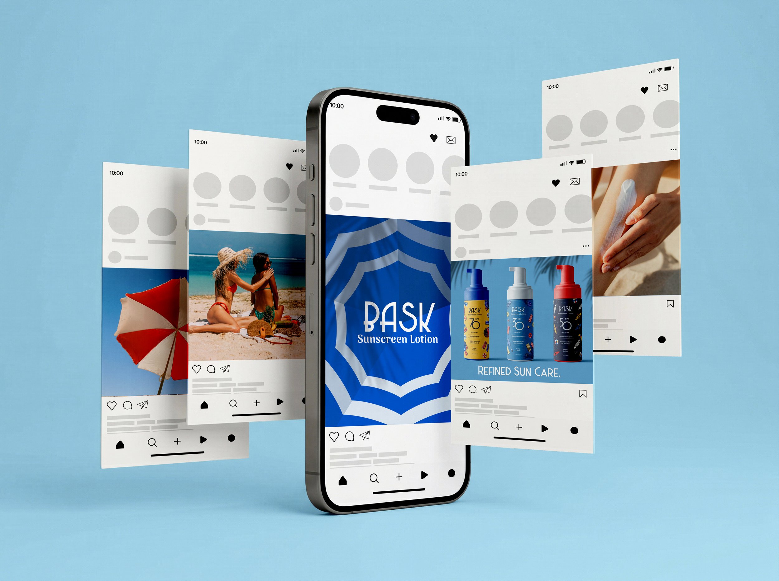
Branding | Packaging | Identity Systems
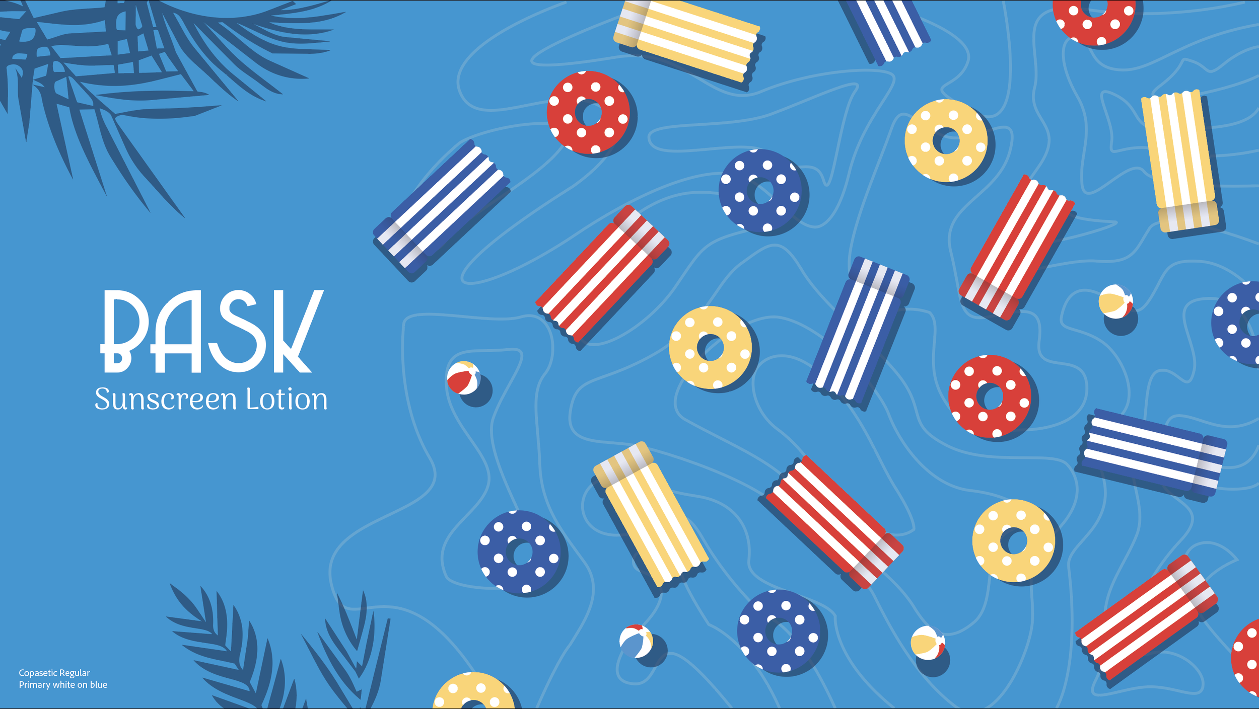
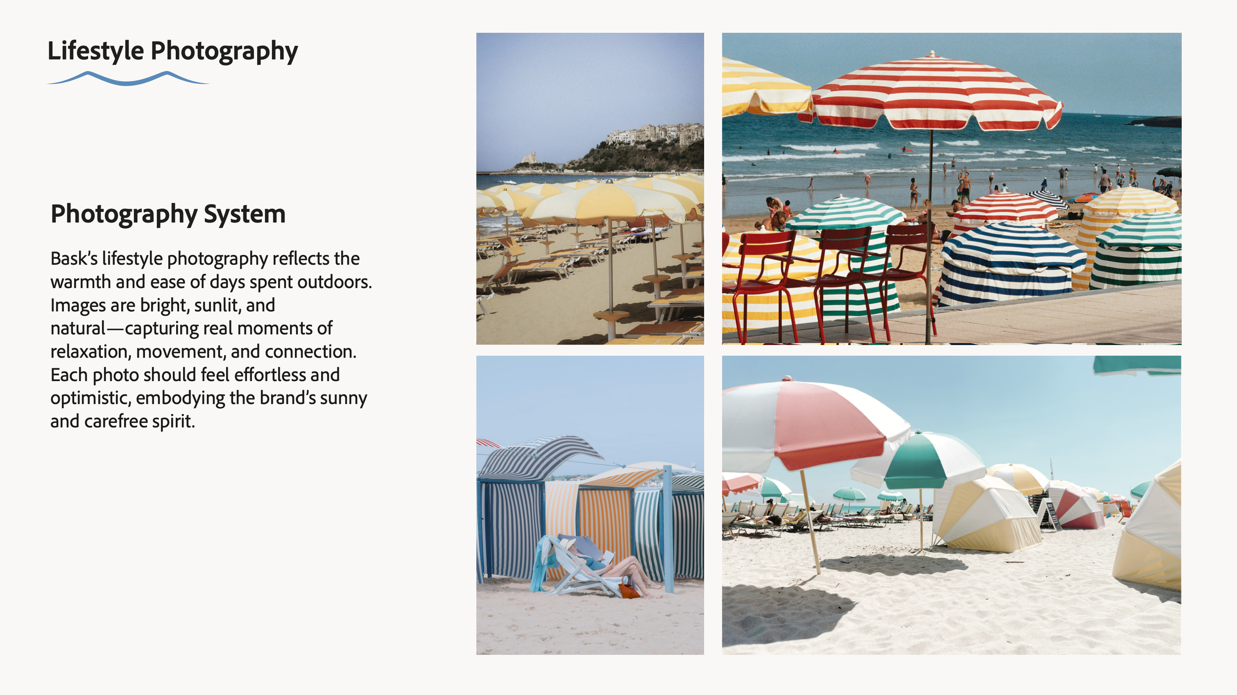
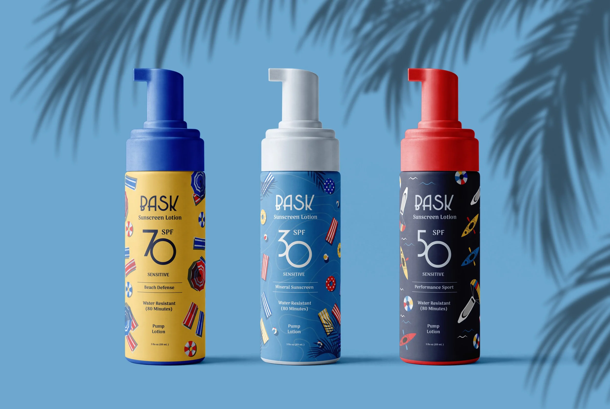
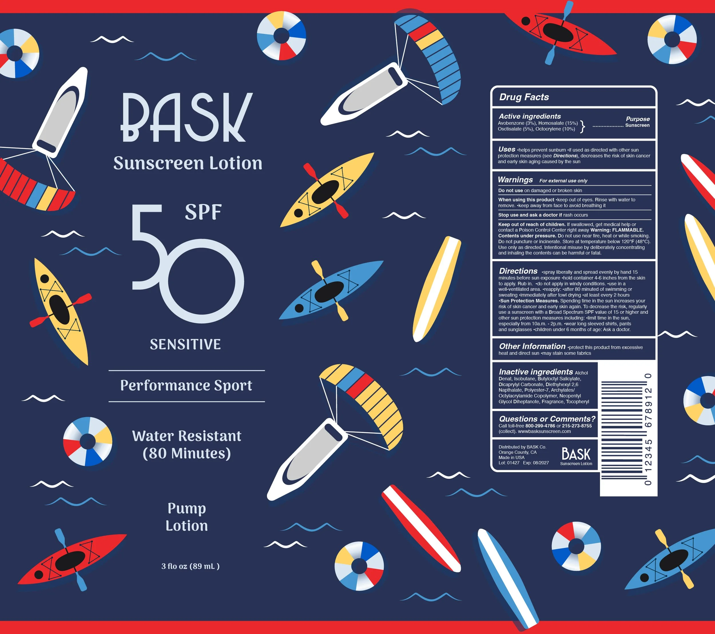
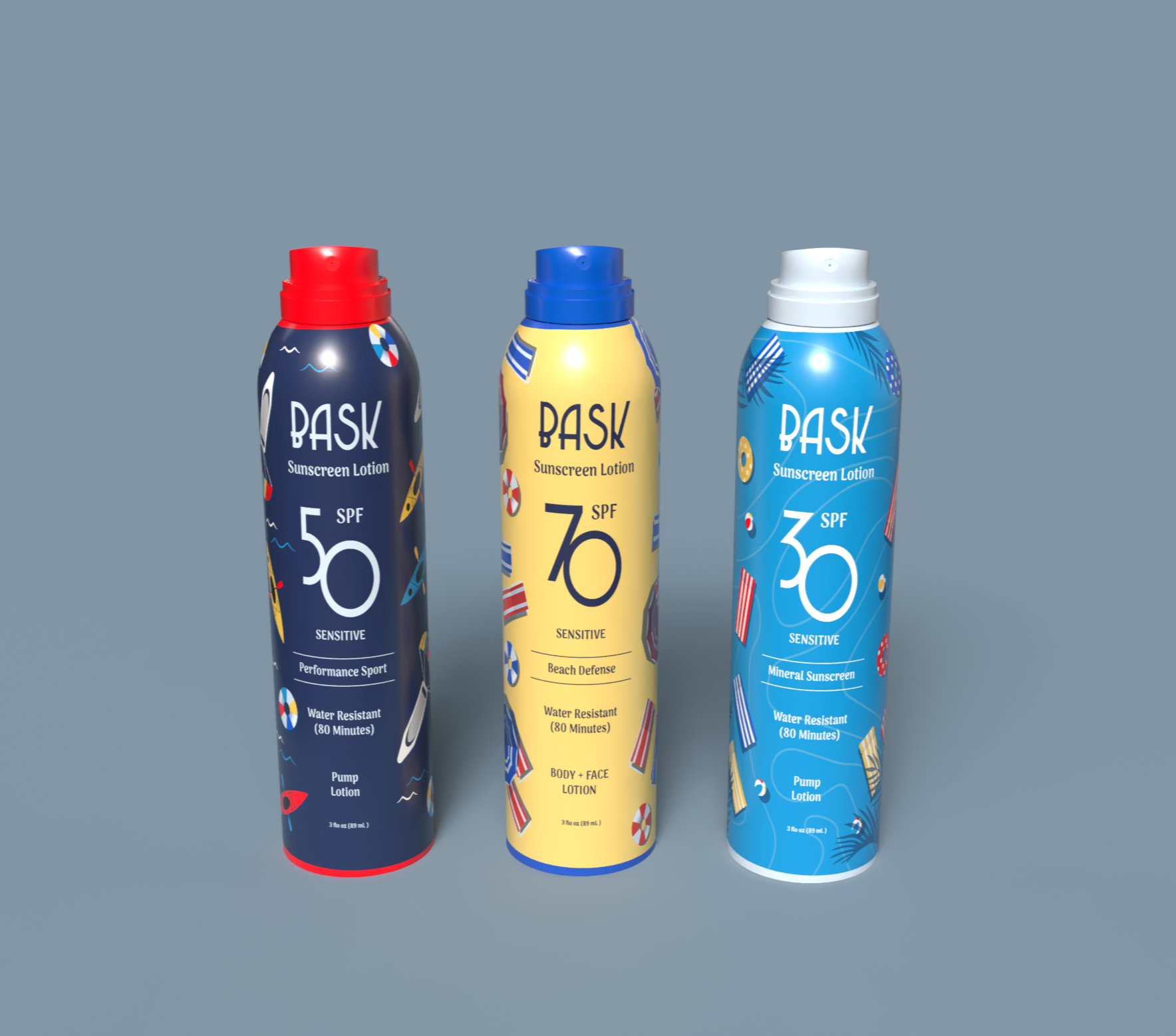
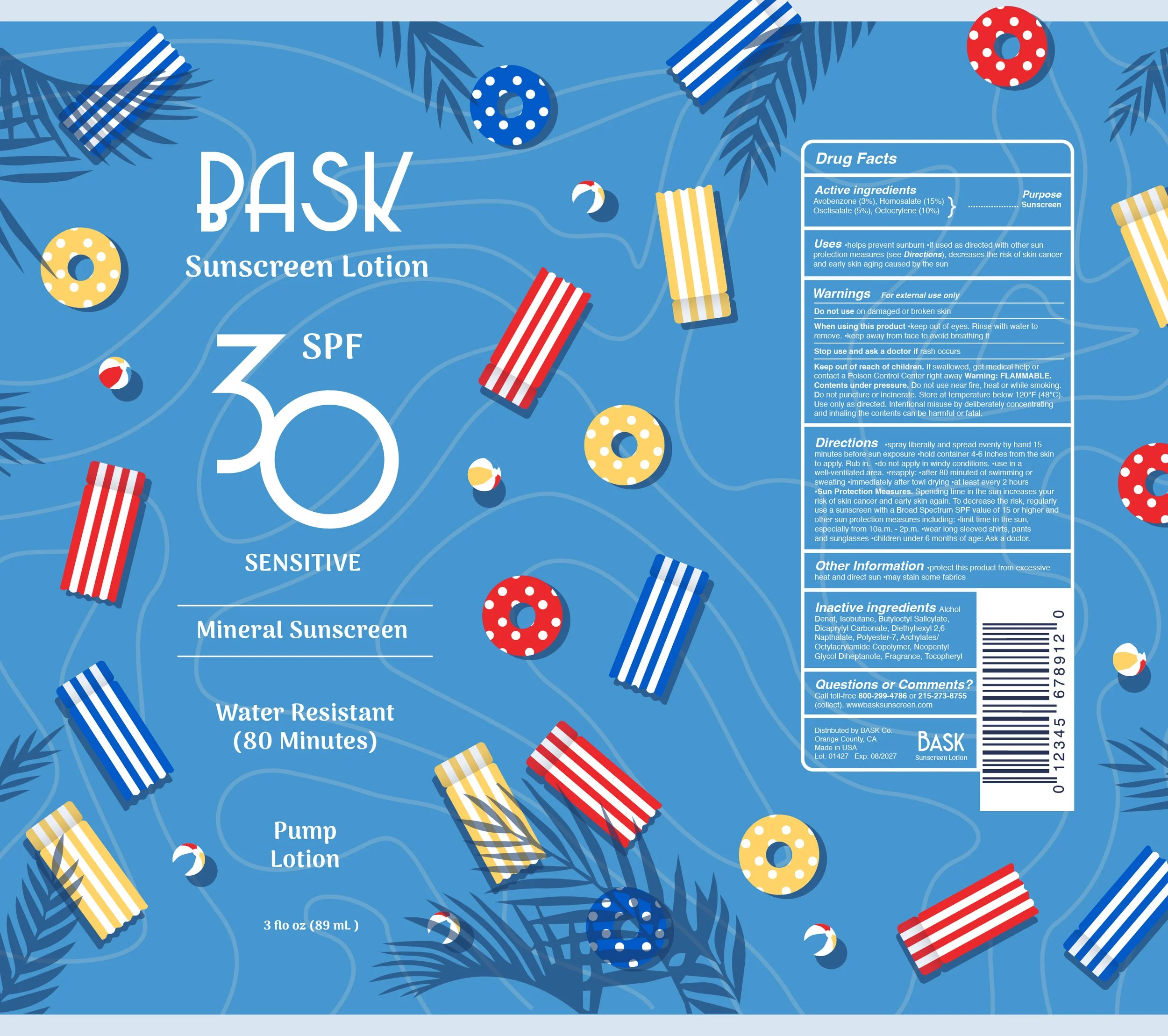
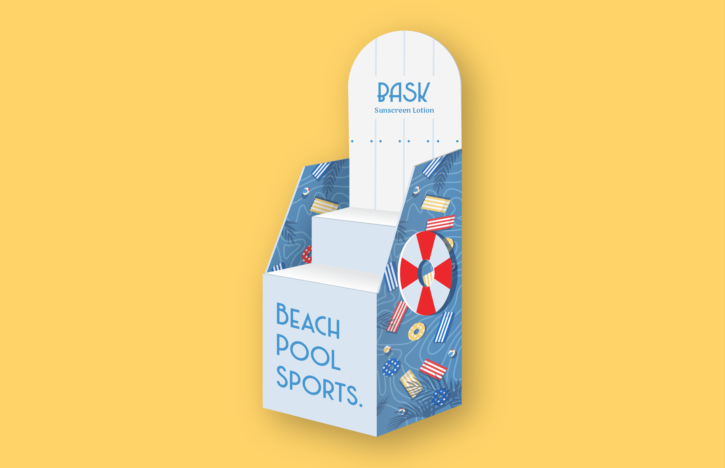
Bask Sunscreen was designed to shake up the sun care market by ditching the clinical white-and-orange look that dominates the industry. Instead, a strategy of "visual disruption" was employed, utilizing a bold primary color palette and intricate, vibrant patterns to evoke a luxury, Sephora-ready aesthetic. By tying these patterns to specific activities like the beach, pool, and sports, the packaging is meant to jump off the shelf and stand out in a crowded aisle.
At its heart, the mission was to create something truly recyclable. That goal was brought to life through 3D modeling in Adobe Dimension, proving that a sustainable, non-polymer alternative can actually hold its own against the big corporate giants. To make sure the concept worked, deep research went into the competitive landscape, looking at everything from pricing and archetypes to the 4Ps of marketing.
Timeline
October – November 2025