

FERRY MORSE
PACKAGING
CPG Rebrand | Package Design
the approach
Competitive Market Analysis, Consumer Pain-Point Mapping, Visual Restraint
Project Scope
CPG Challenger Rebrand | Sustainable Packaging |
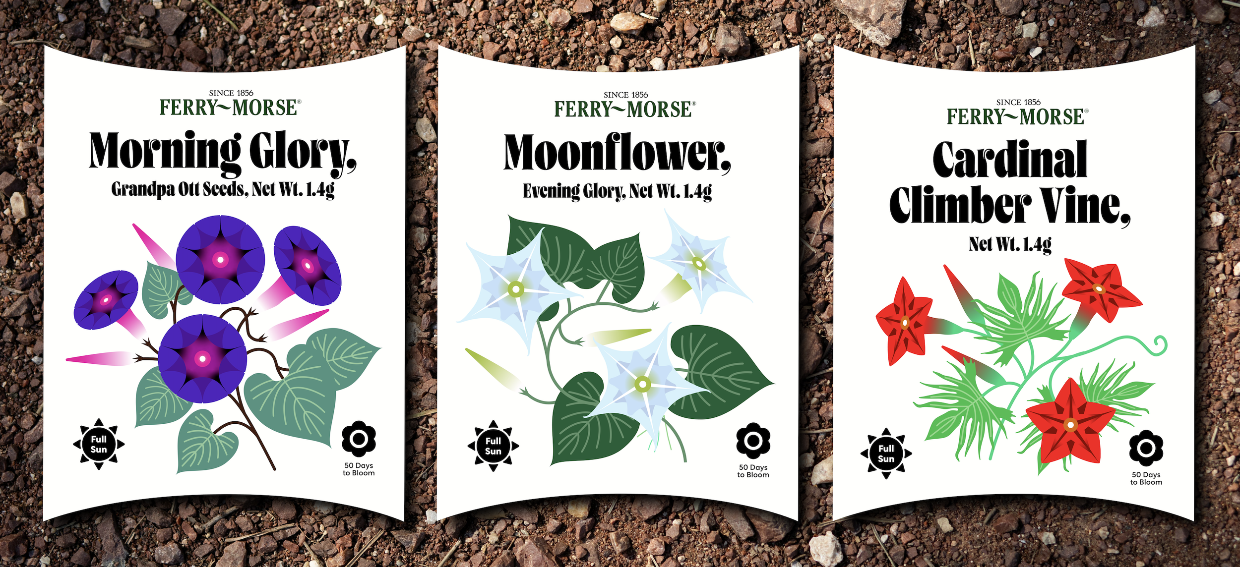
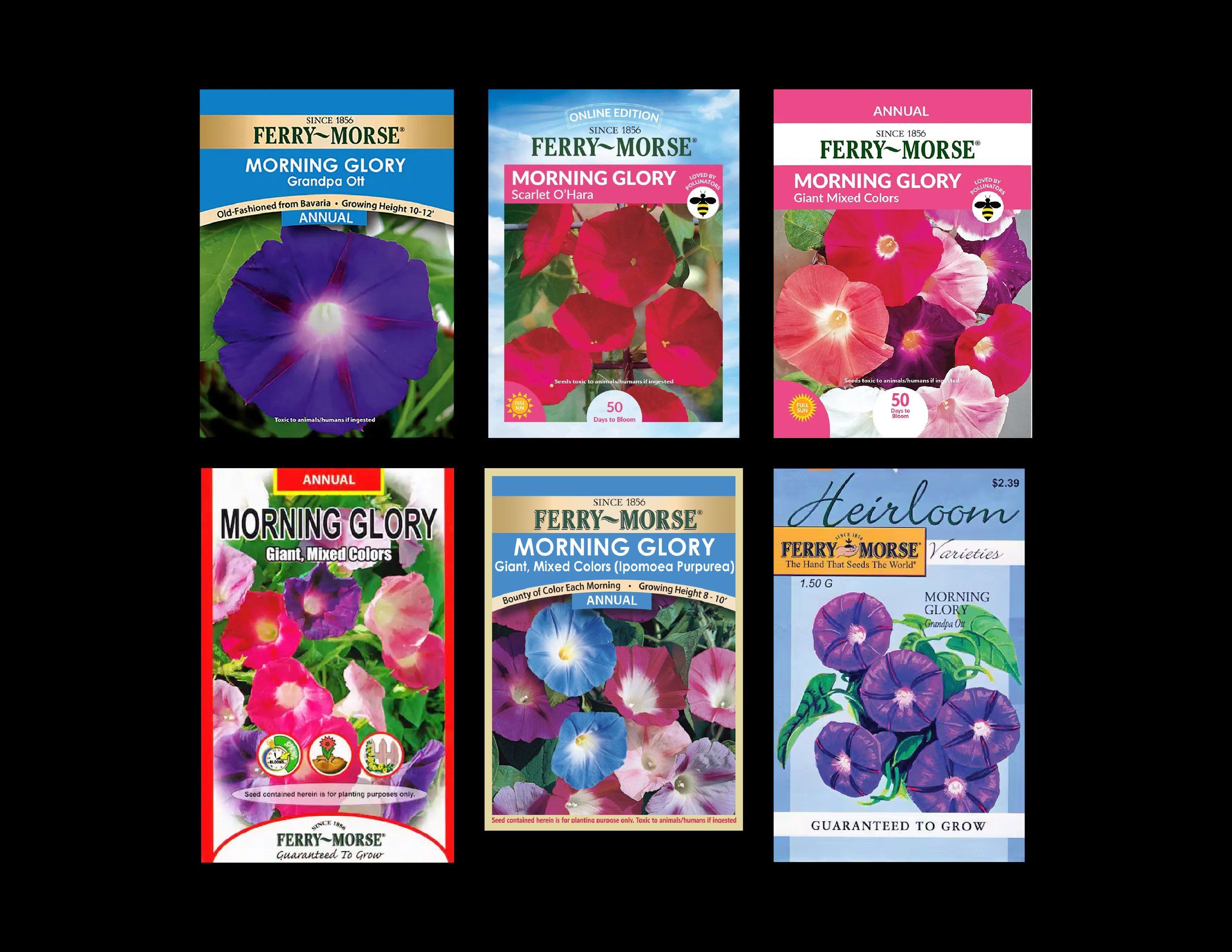
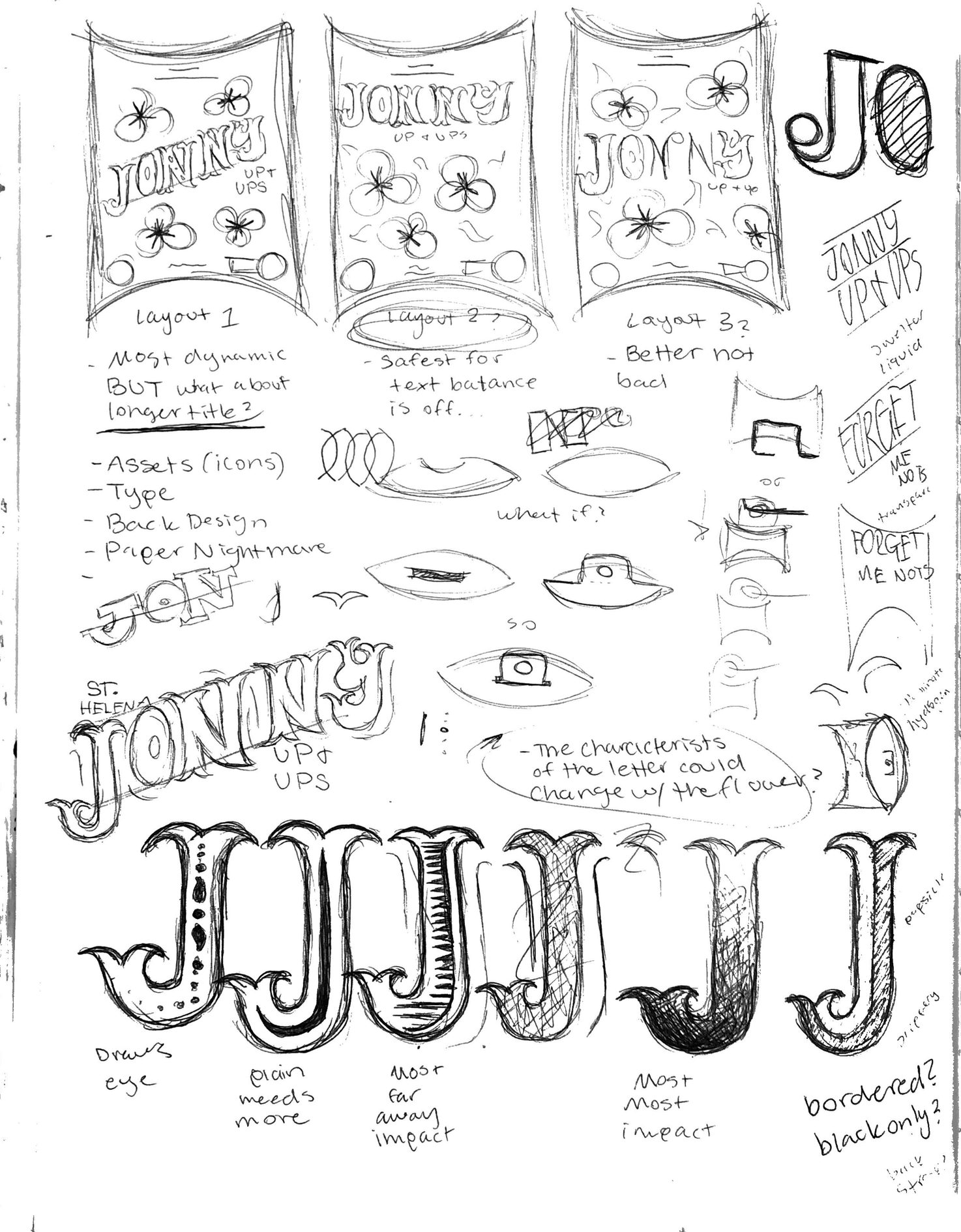
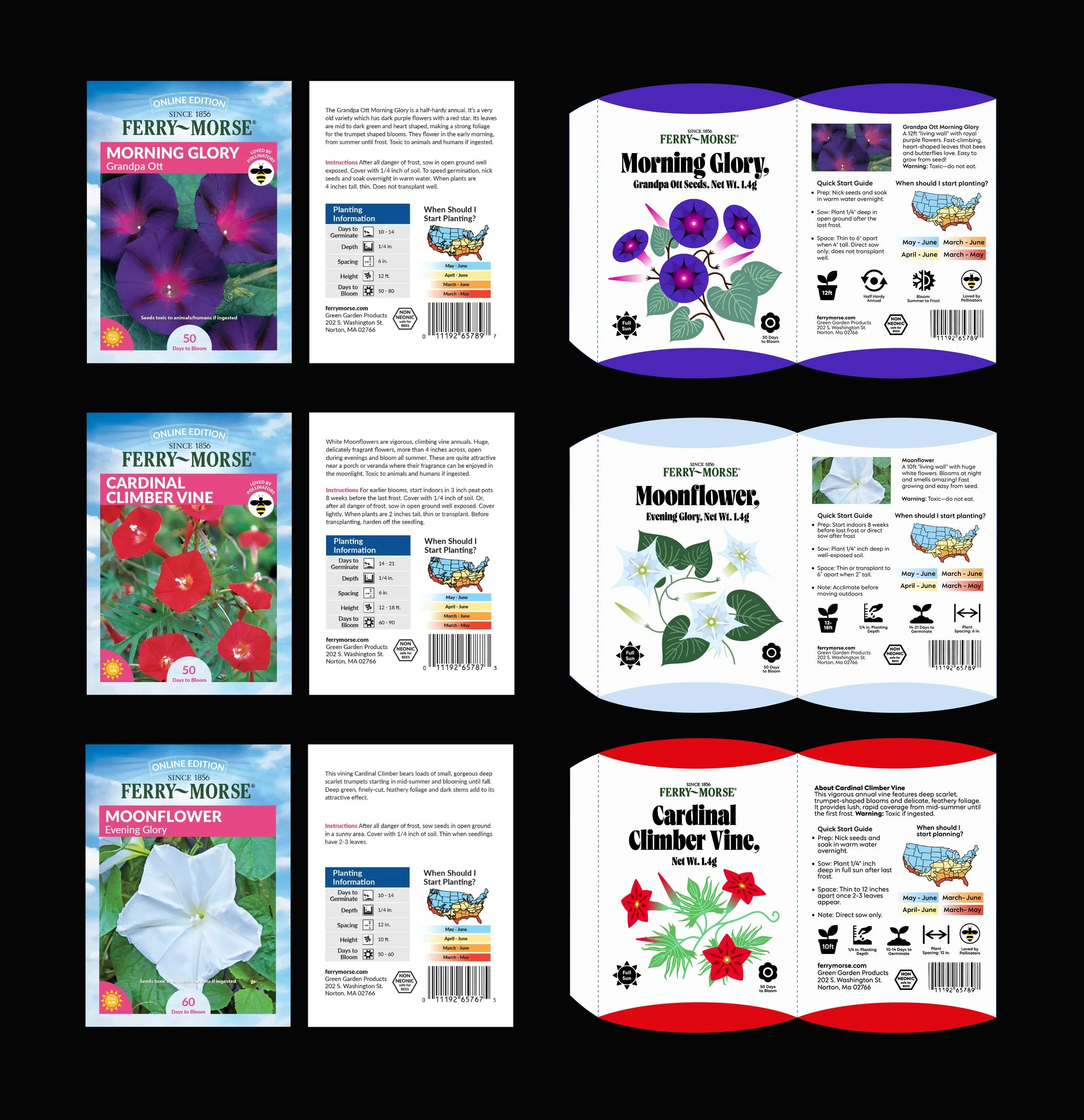
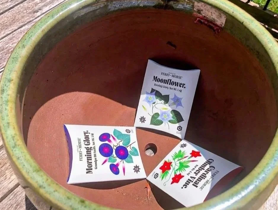
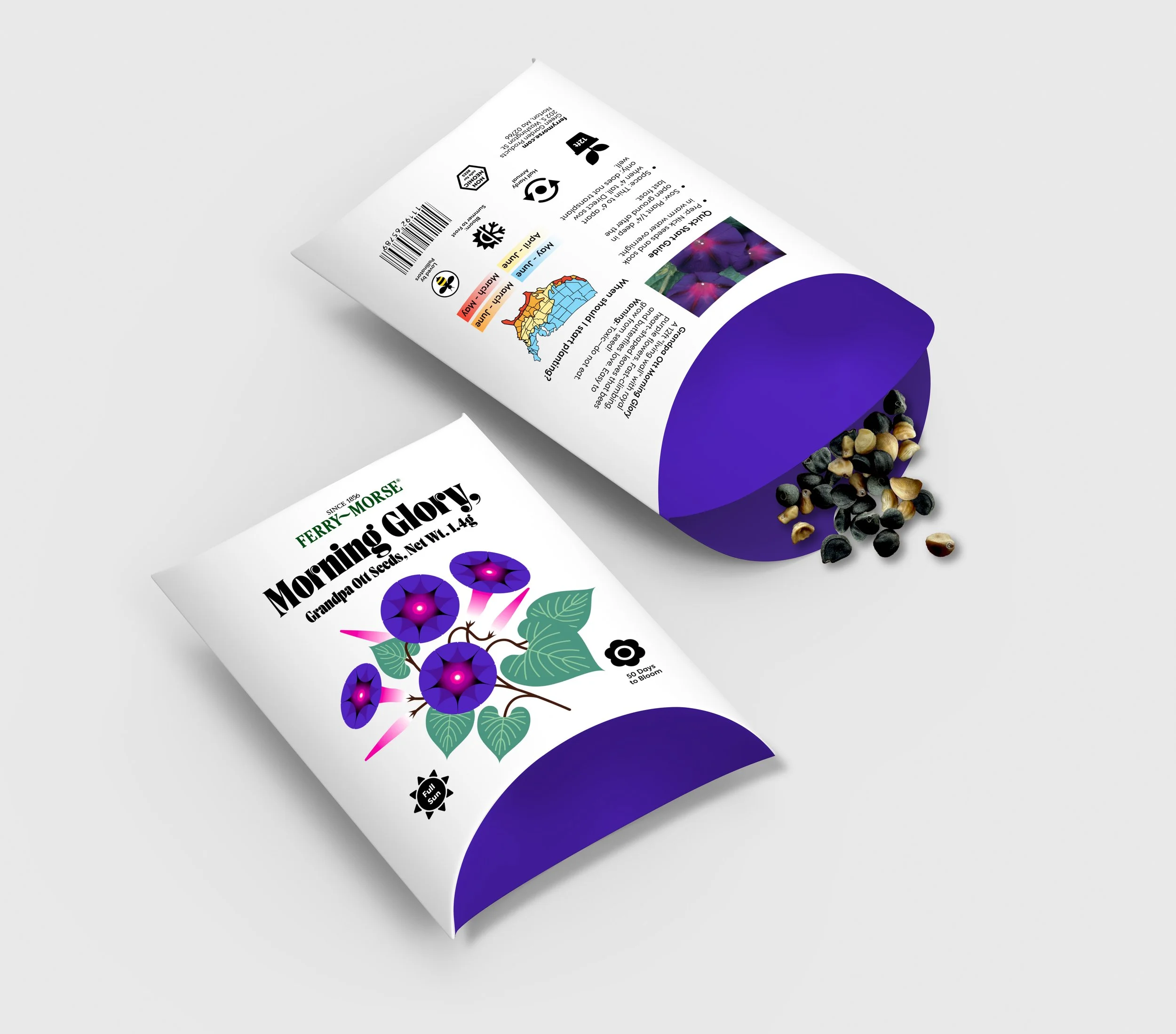
Ferry-Morse Rebrand was all about taking a brand that felt a bit dated and elevating it for today’s gardeners. The main goal was to tackle the "performance gap"—that common frustration where people feel like mass-market seeds are unreliable. Research showed that this usually comes down to a poor user experience: instructions are often too cluttered to follow, and standard flat packaging makes seeds a nightmare to handle.
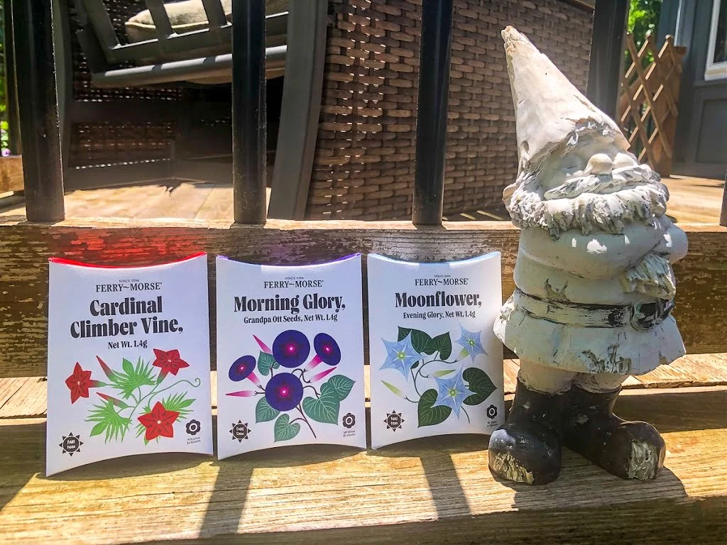
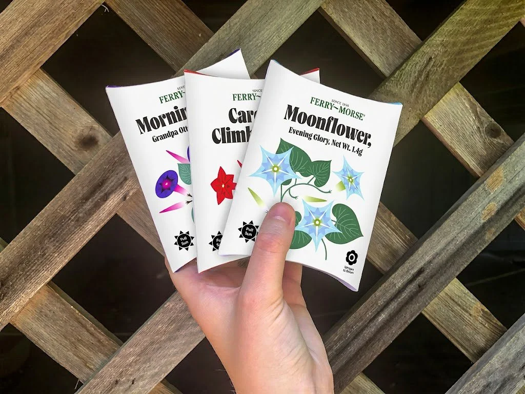
To fix this, the strategy focused on "visual restraint," trading chaotic, crowded text for a system that uses clean, open space to actually help the gardener. Instead of the usual photography-heavy look, the rebrand centers on custom illustrations to stand out on the shelf, while still keeping a photo of the actual flower on the back so there’s no guesswork about what you’re growing. The structural design was just as important as the look. Replacing the traditional flat packet with a pillow-pack design made a huge difference in how the seeds are poured, transported, and stored.

Timeline
March – April 2026