Sunscreen Packaging
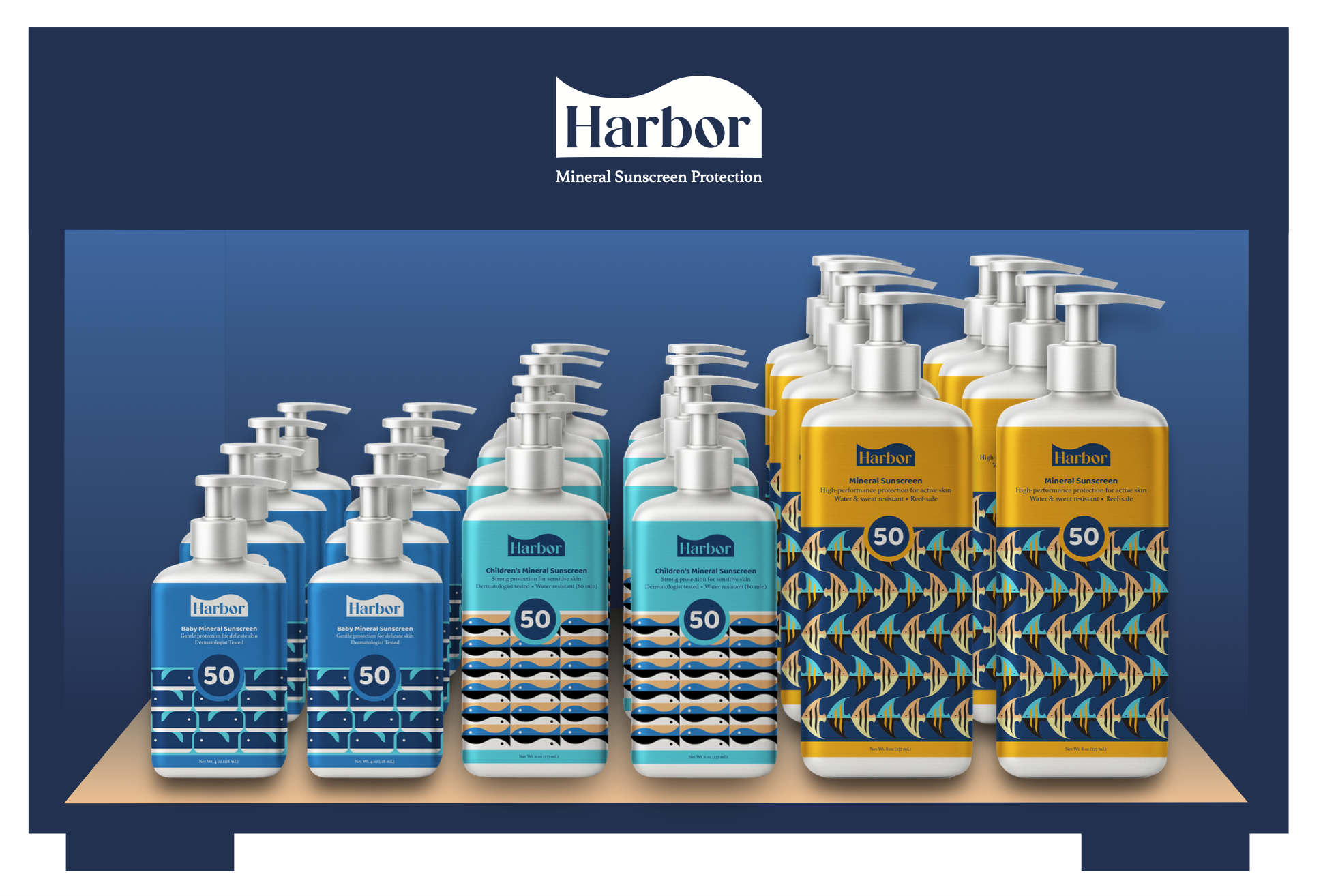
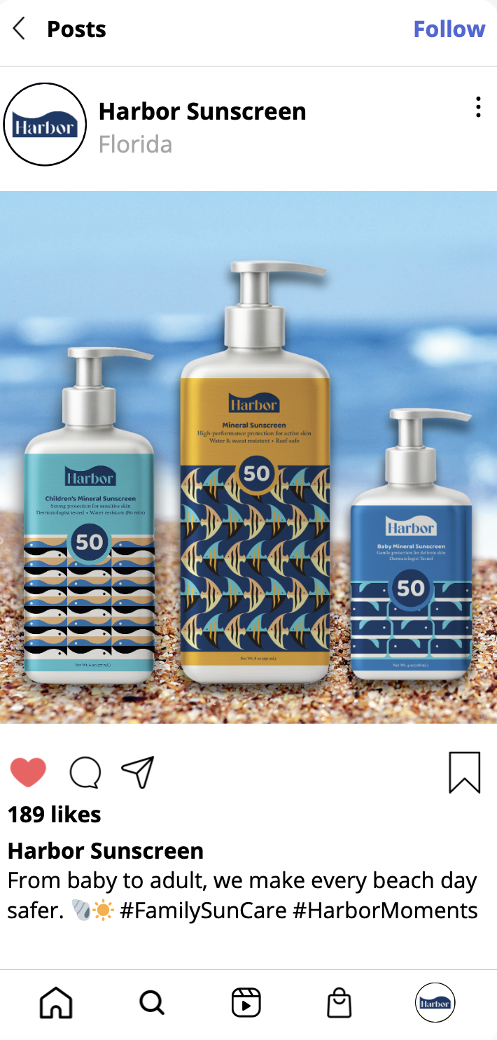
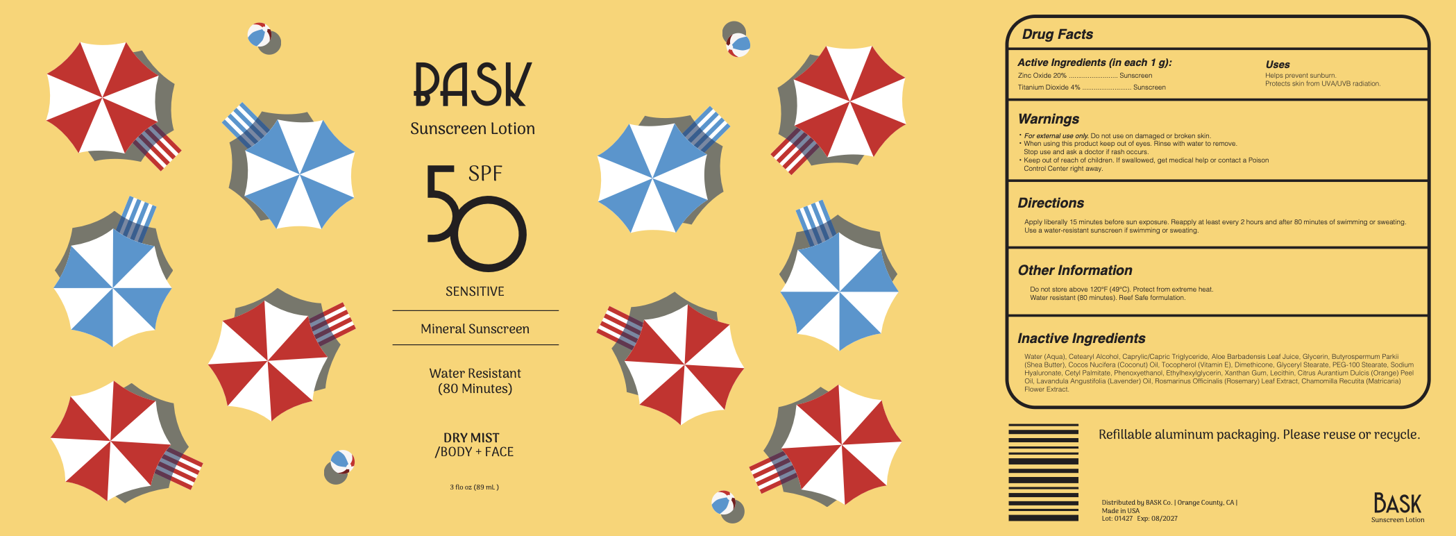
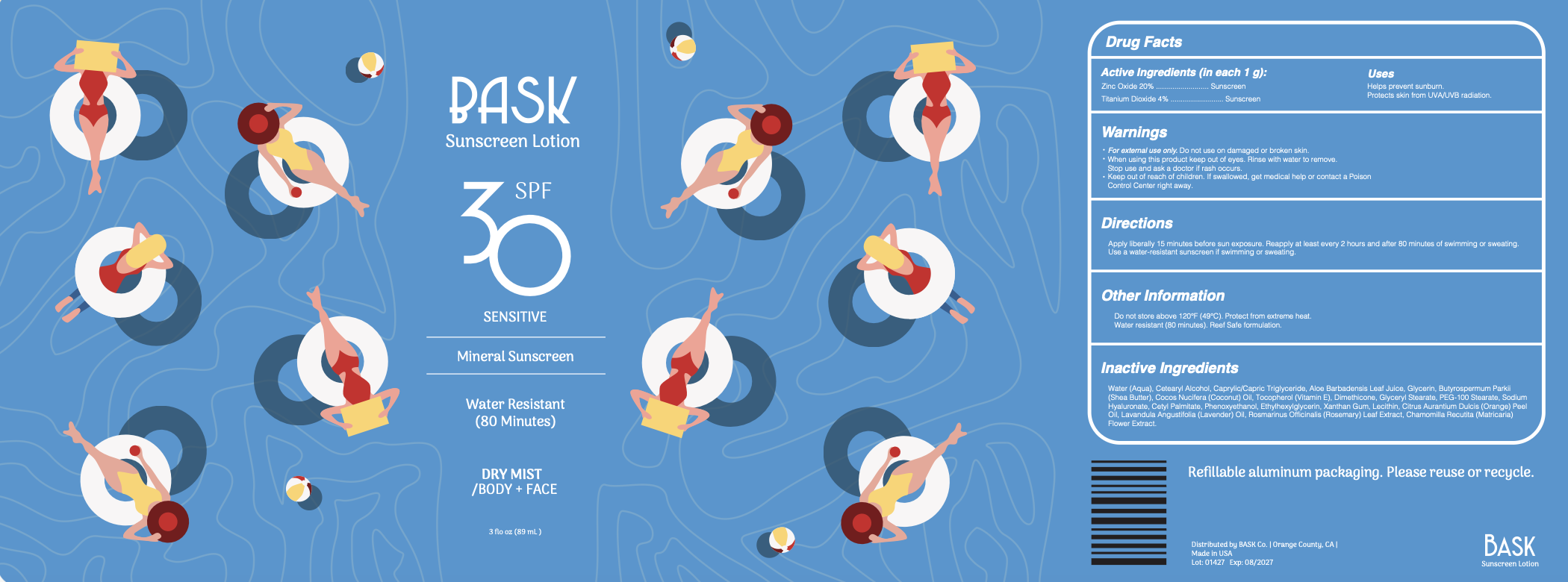
A disruptive sun care branding system that replaces petroleum-based plastics with two distinct identities: a high-end, trend-forward line for intense sun protection and a vibrant, pattern-driven collection for families.
Concept 1
Project Scope: Branding | Packaging | Identity Systems
Project Duration: Spring 2025 (Semester-long)
Tools Used: InDesign | Illustrator | Photoshop | Lightroom | Canva
Project Objective
The primary objective of this project was to disrupt the sun care market by developing a category-leading brand identity and product line that eliminates or radically reduces the use of petroleum-based plastics. By conducting deep primary and secondary research from the perspectives of users, retailers, and manufacturers , the goal was to synthesize a "Business Model Canvas" that proves a sustainable, non-polymer alternative can successfully compete against established corporate CPG (Consumer Packaged Goods) entities.
Design Strategy
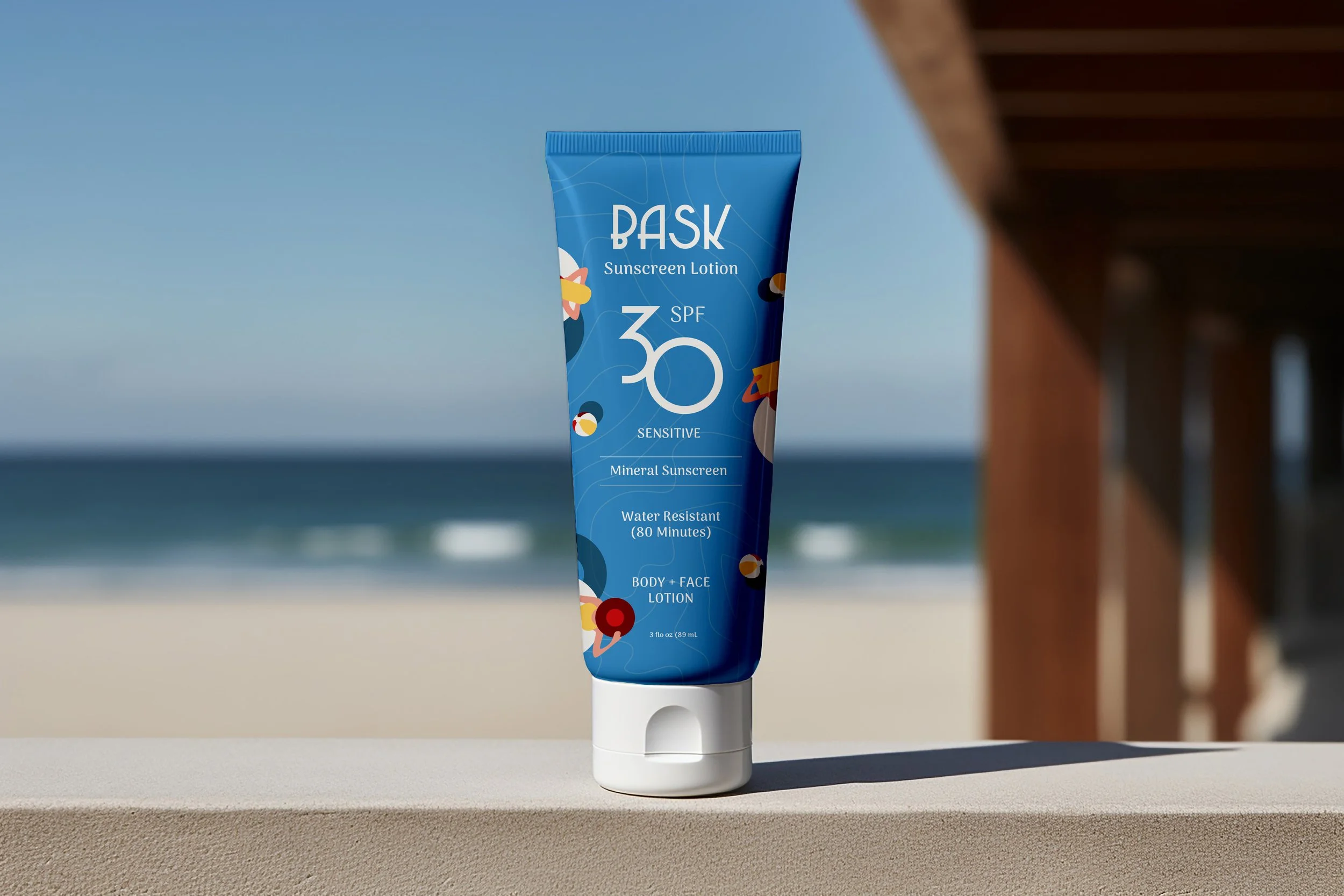
Concept 2
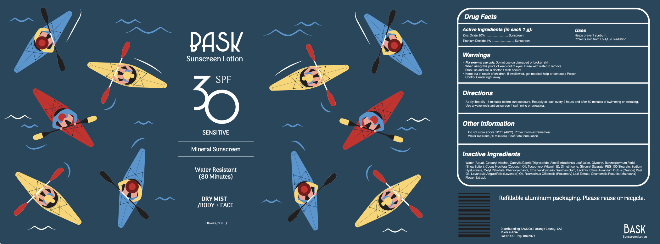
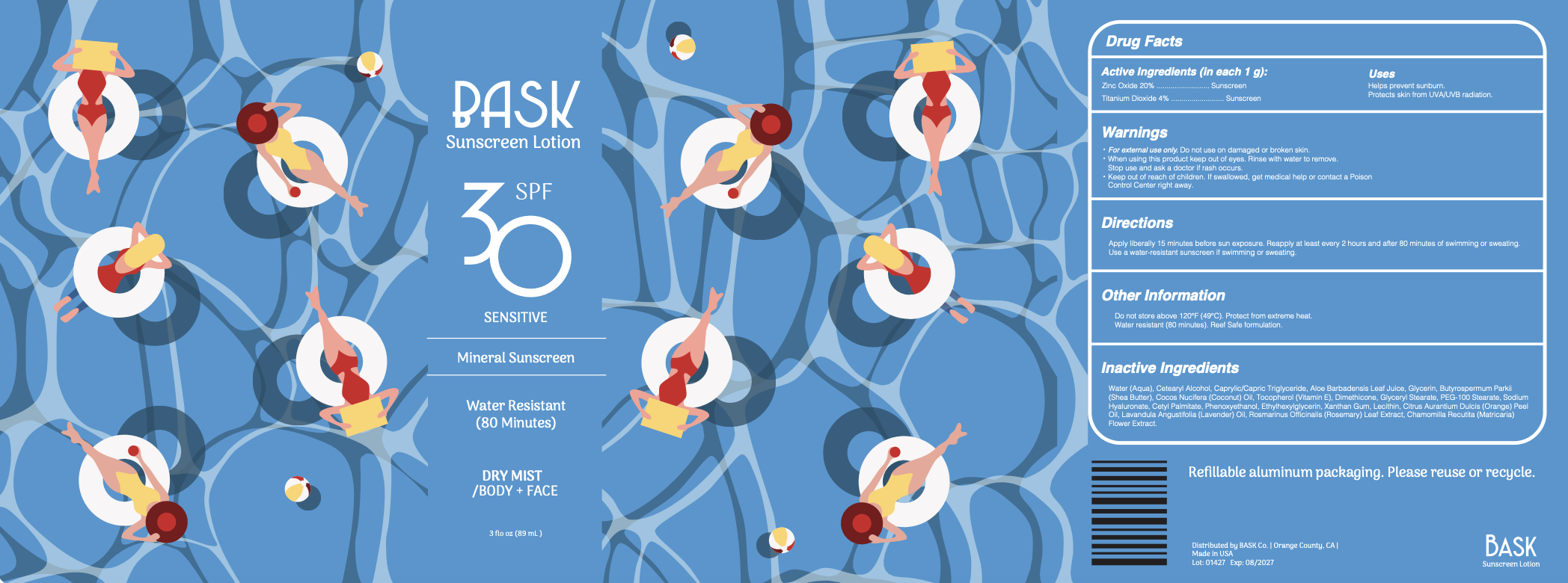
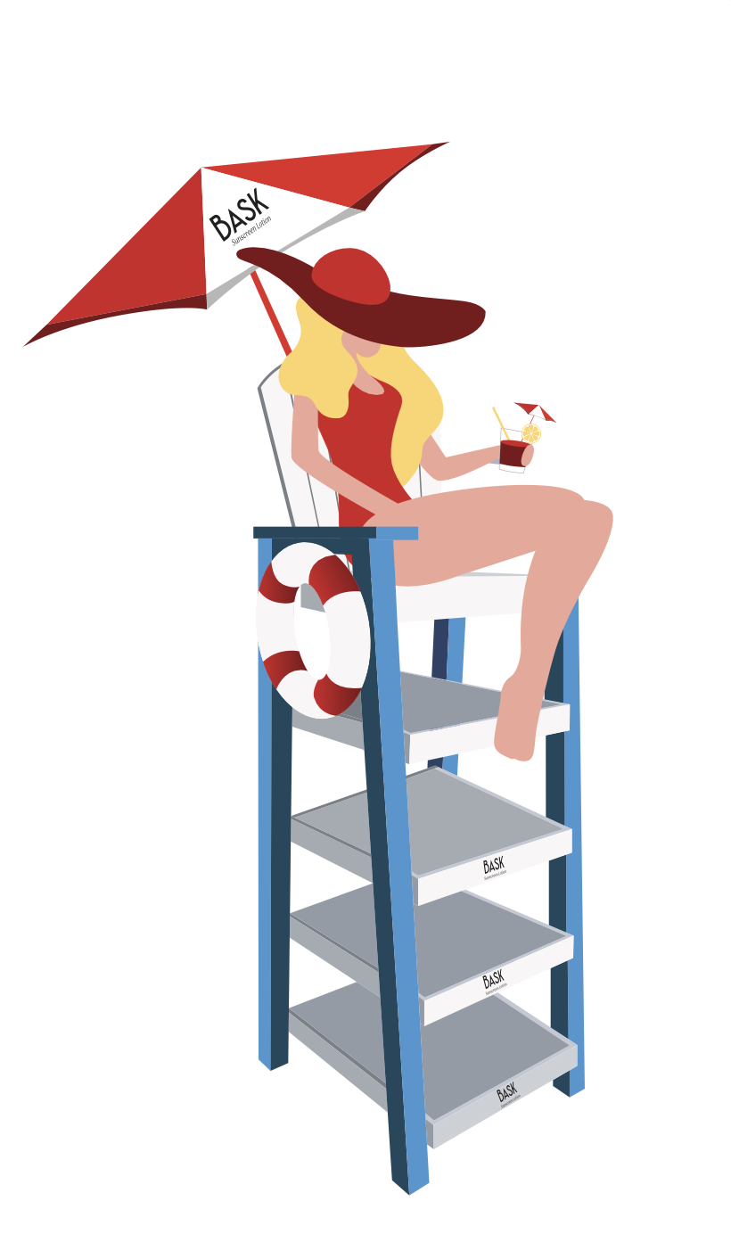
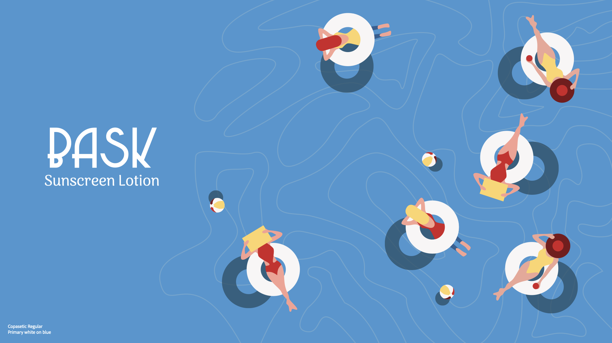
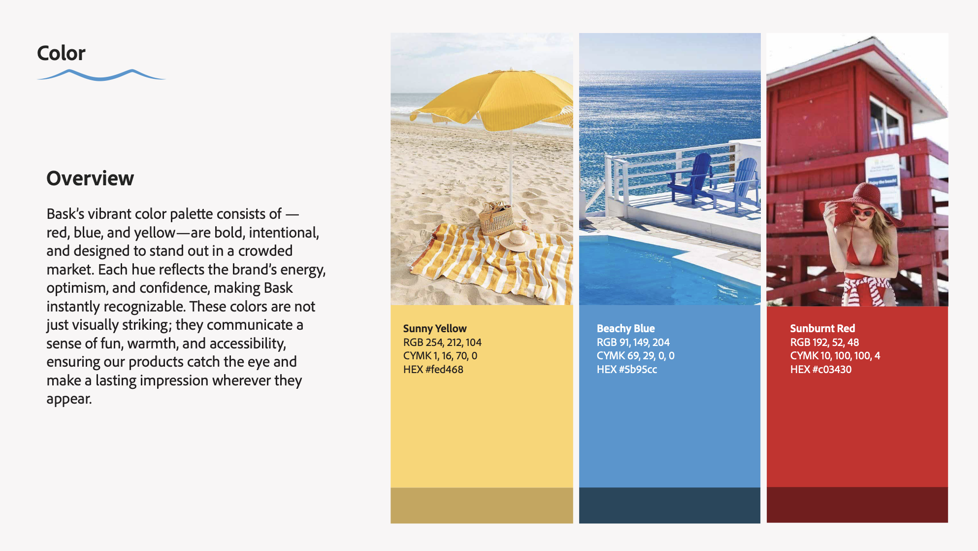

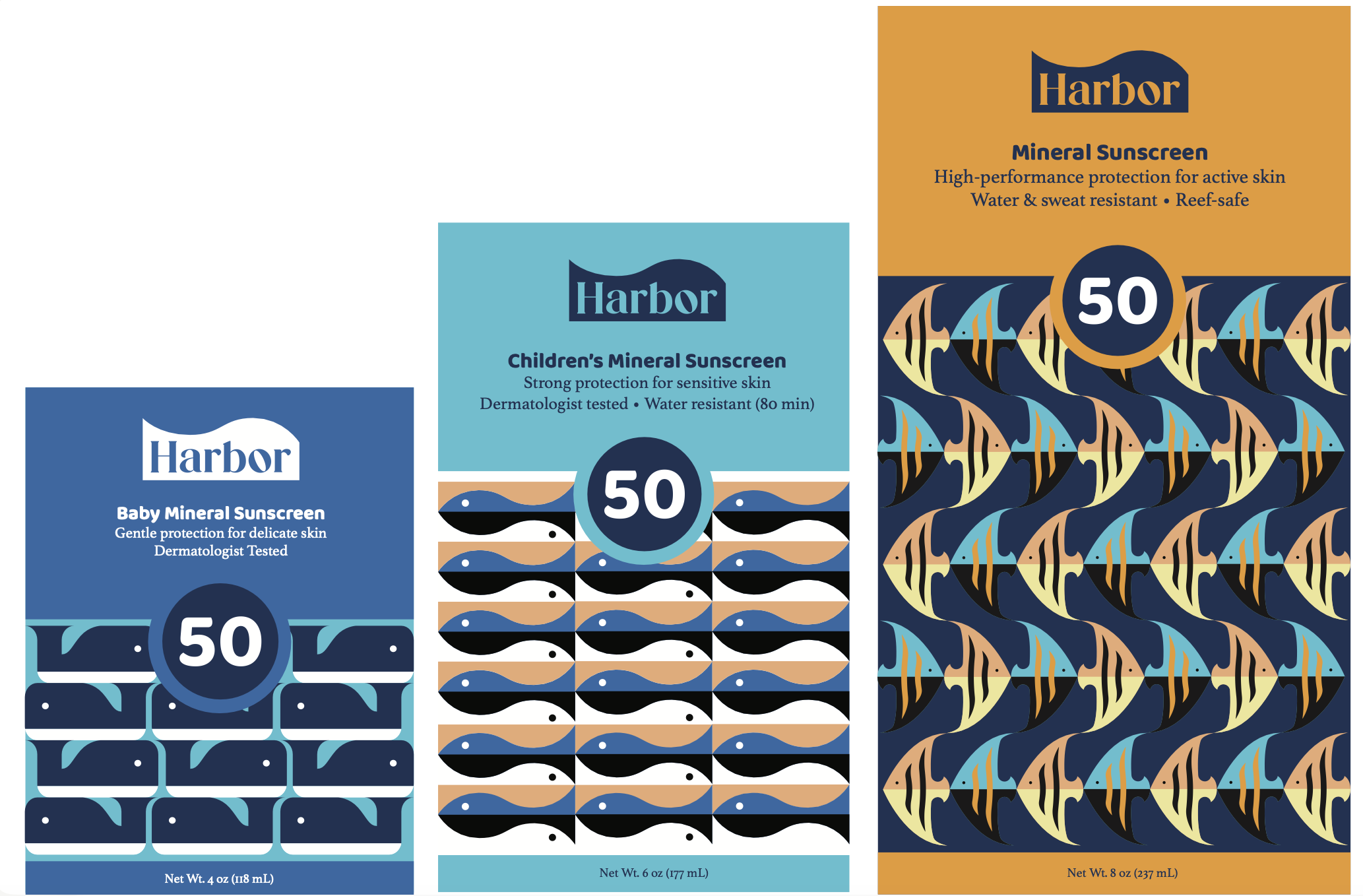
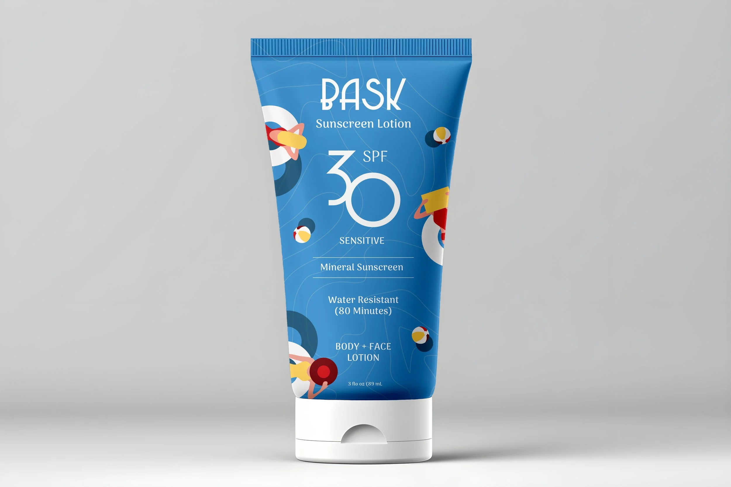
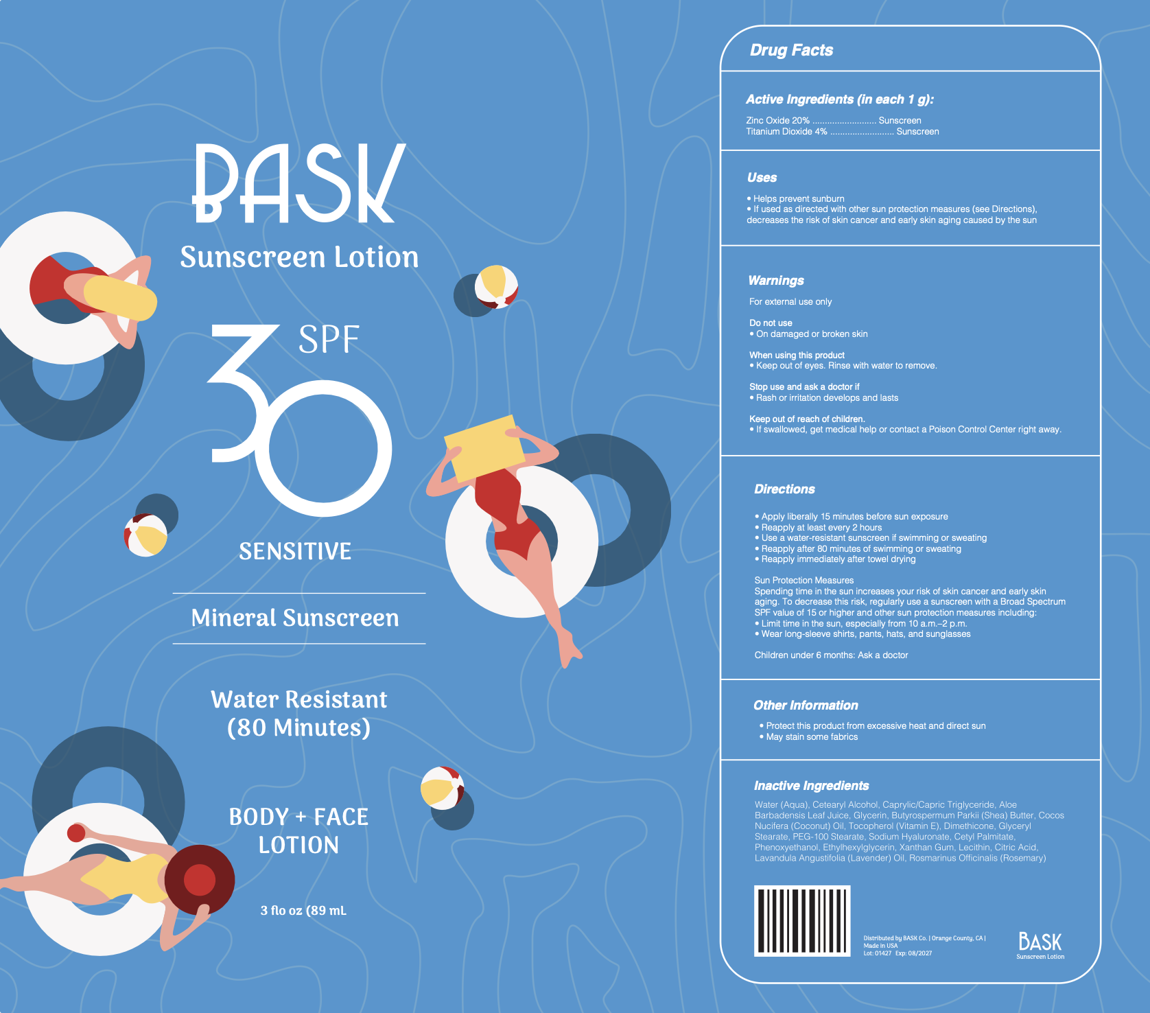
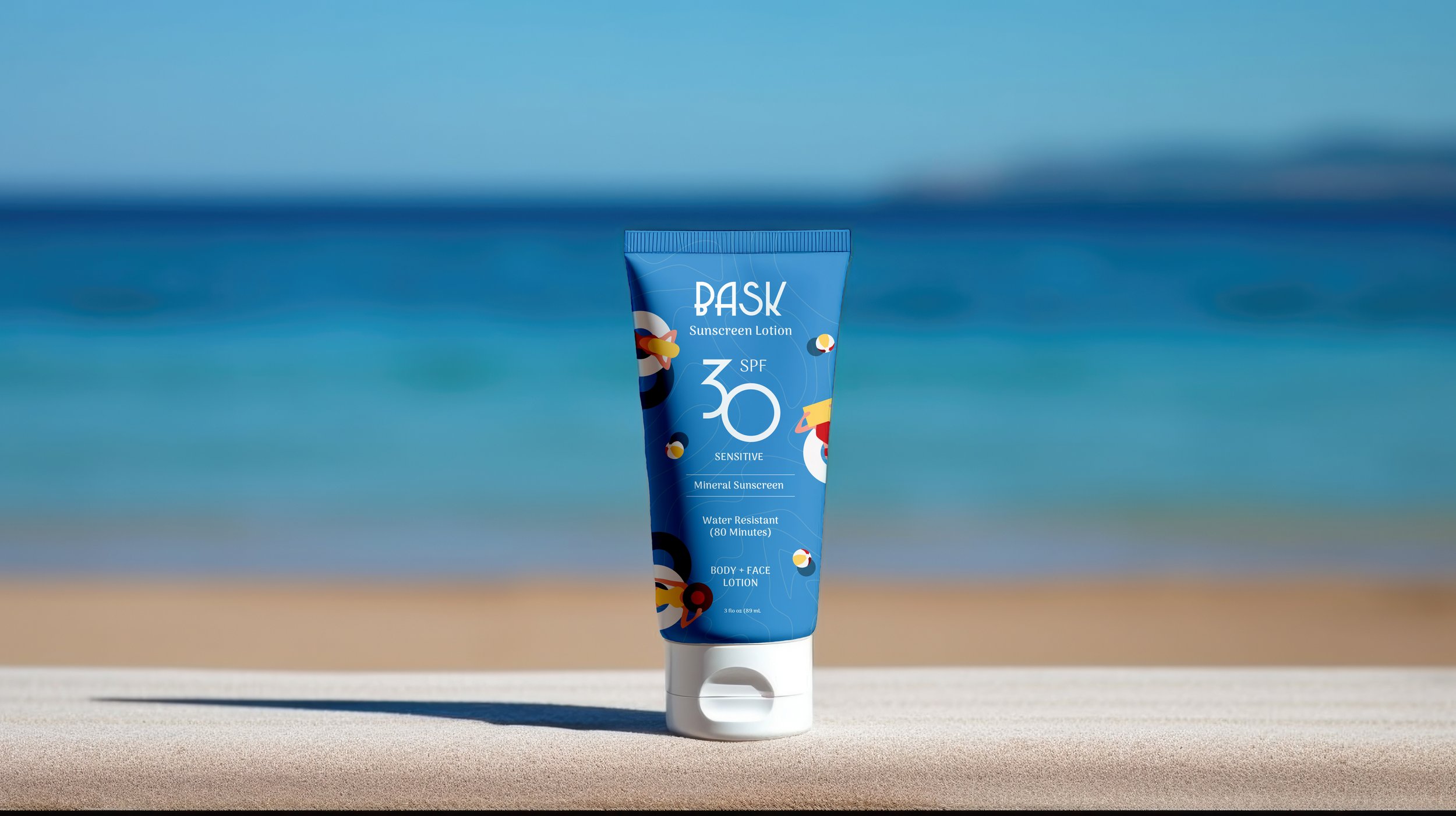
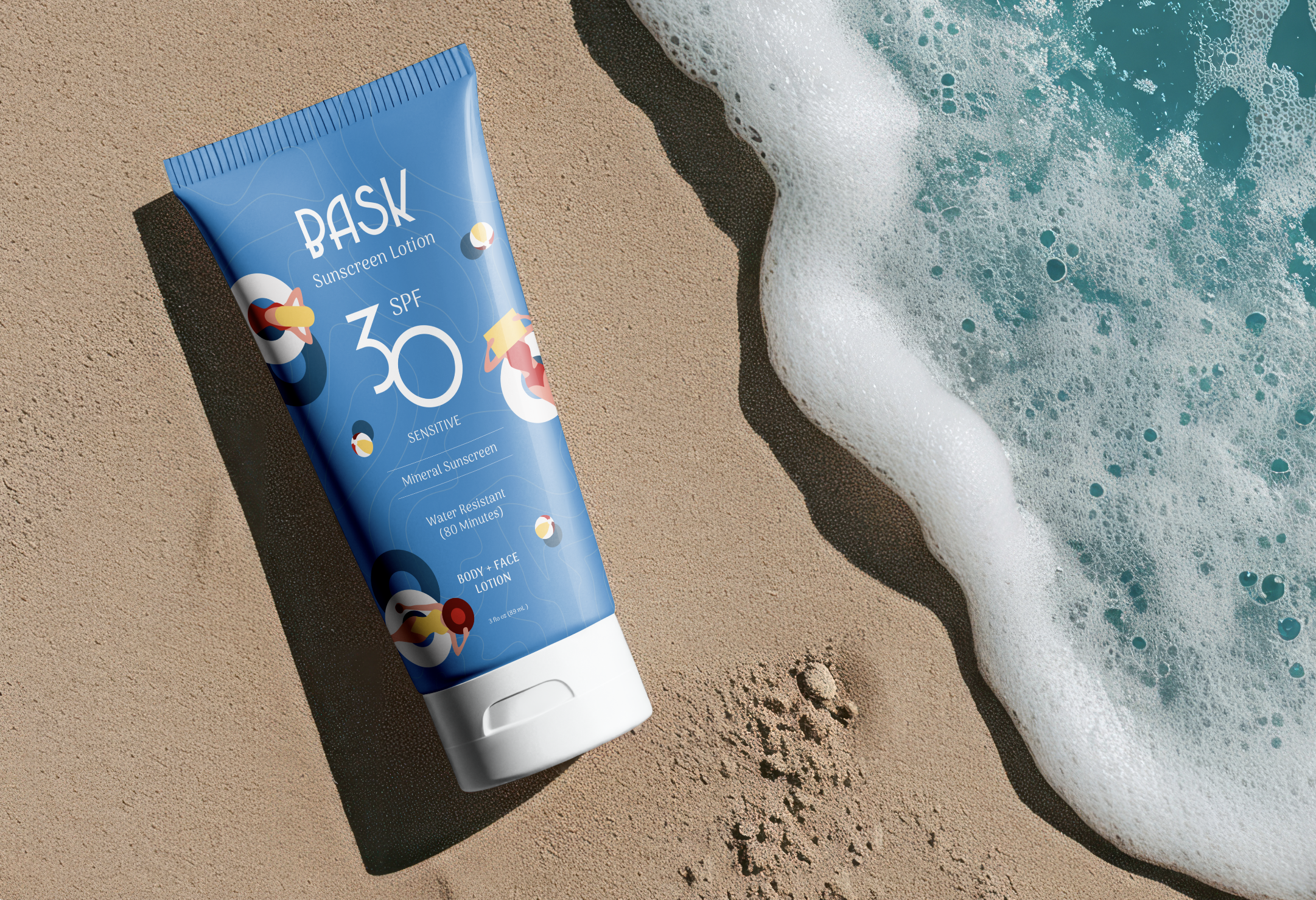
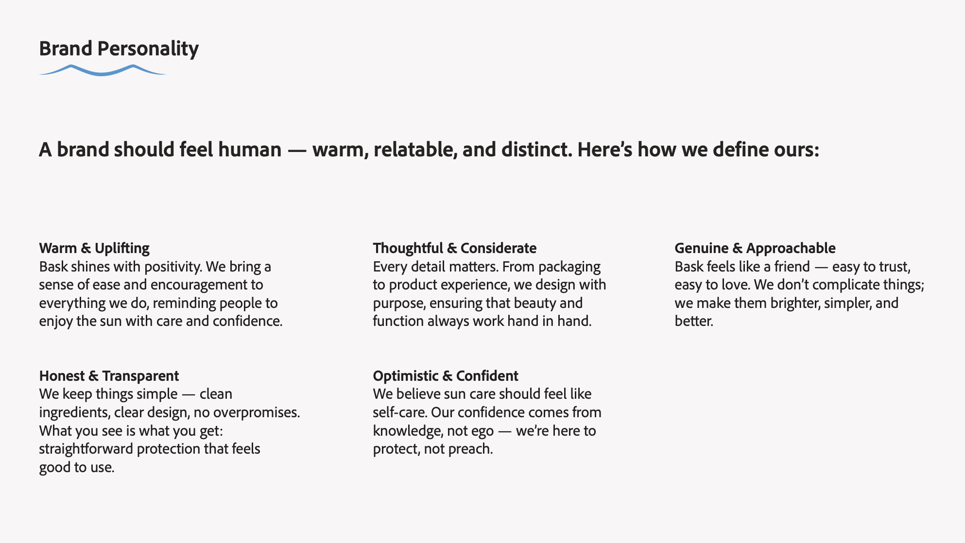
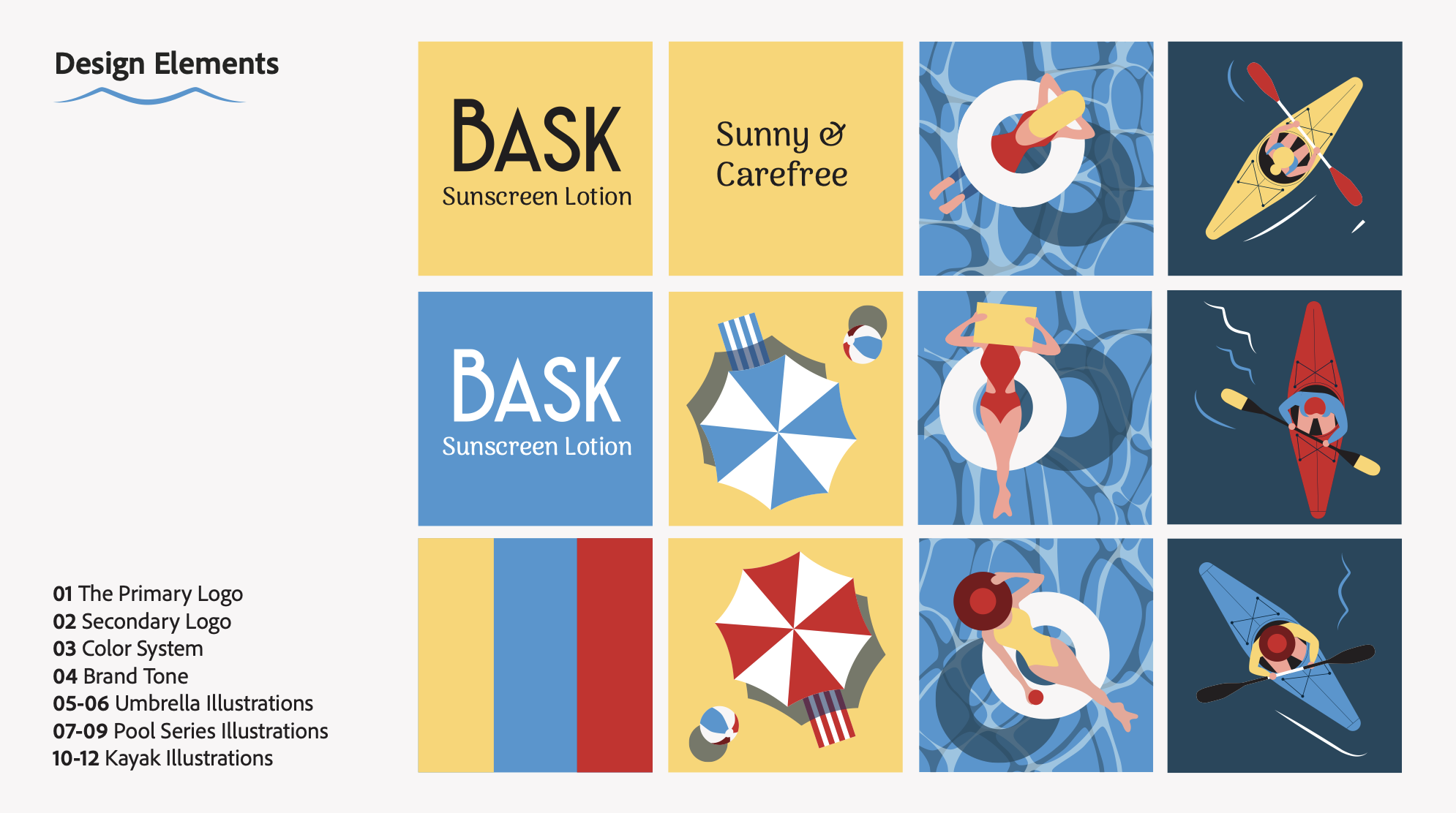
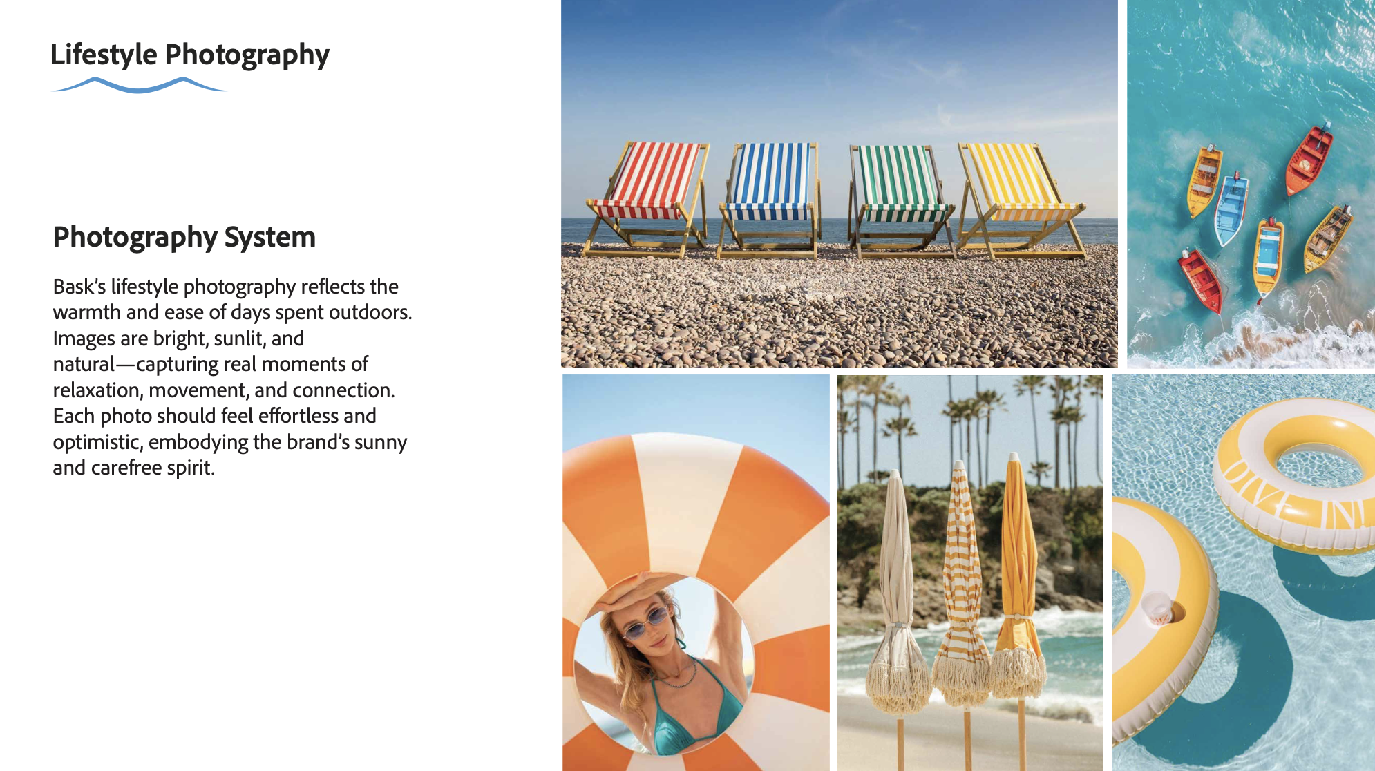
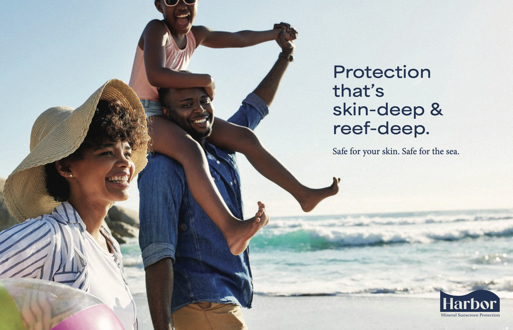
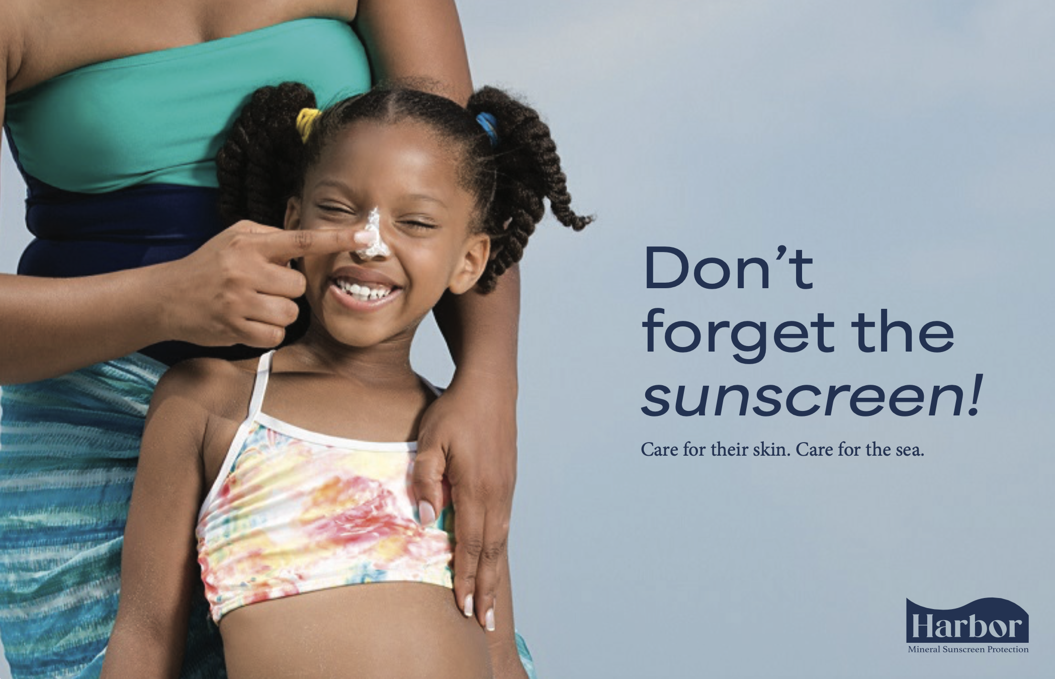
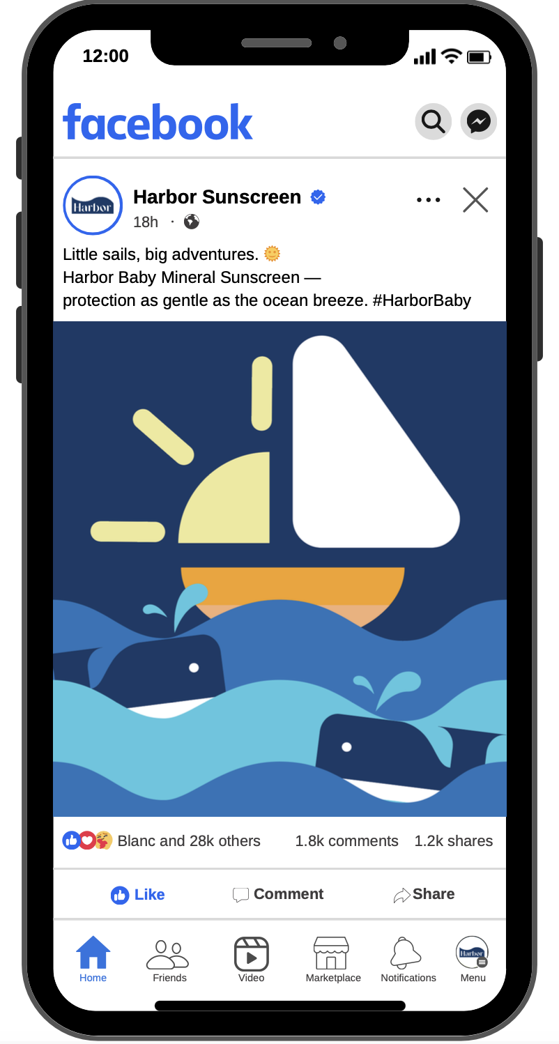
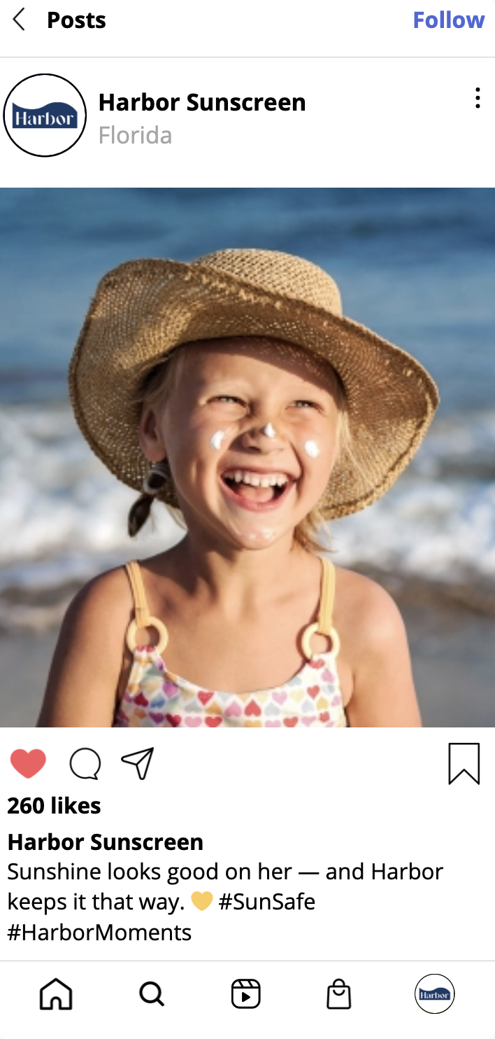
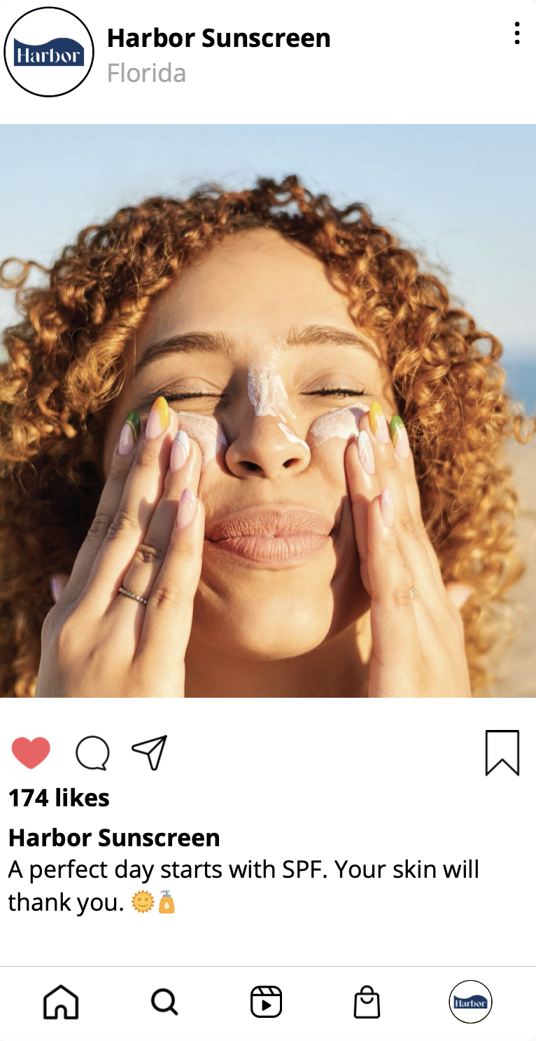
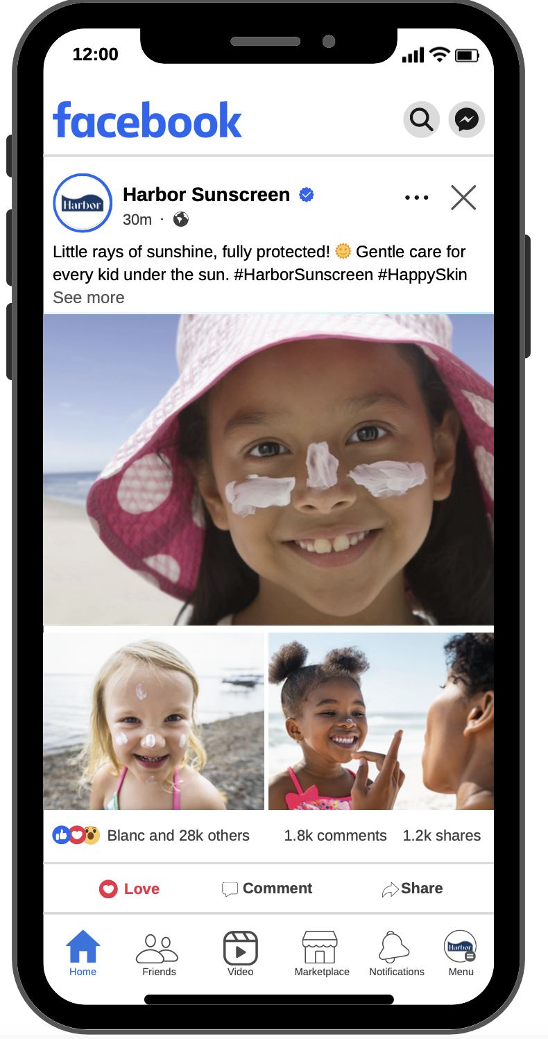
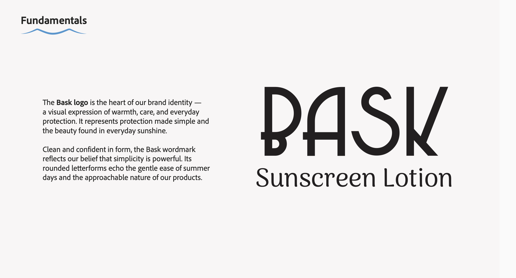
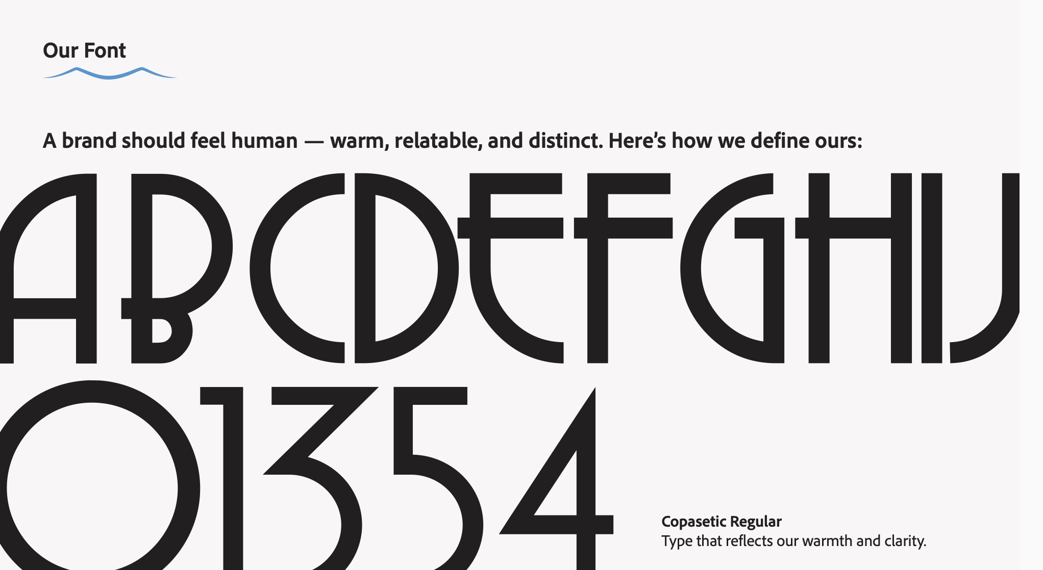
To differentiate from the clinical white and orange aesthetics of traditional sunscreens, I implemented a strategy of "visual disruption" centered on a bold primary color palette and intricate, "hypnotic" psychedelic fish patterns. My approach utilized pattern-driven storytelling to categorize the line—assigning specific designs to Child, Baby, and Adult segments—to create a sense of entrancement and brand loyalty. This was executed through two distinct conceptual lenses: a sophisticated "Sephora-esque" aesthetic for high-end sun protection (Beach, Pool, Intense Sun) and a vibrant, family-friendly concept designed to make sustainable CPG products accessible and trendy for a broader demographic
What I learned