latchkey music
festival
Music Festival Branding
the approach
Experimental Typography, Material Exploration, Hybrid Production
Project Scope
Typography | Print Design | Analog + Digital Media
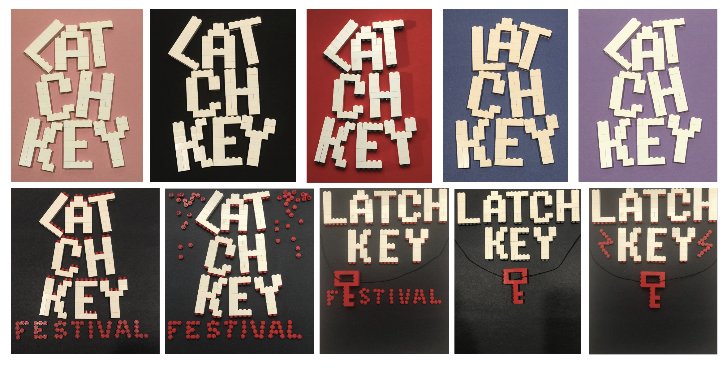
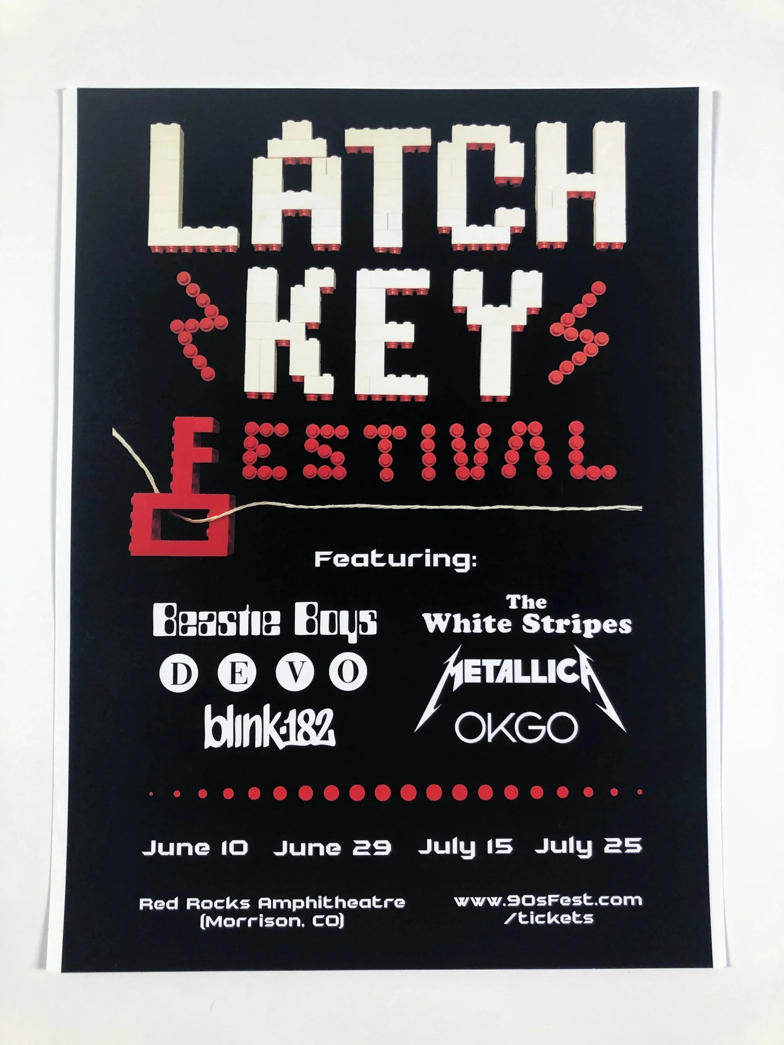
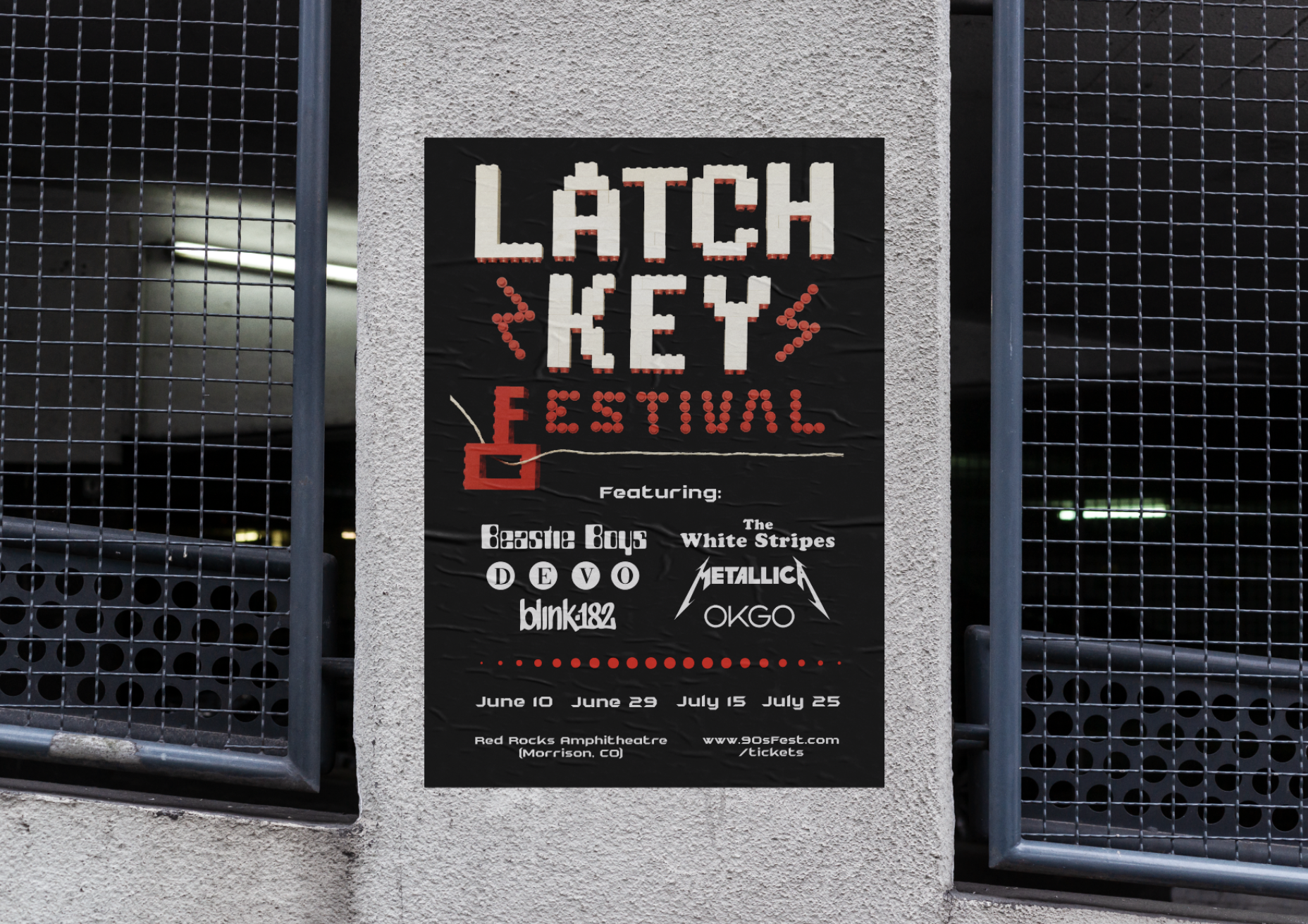
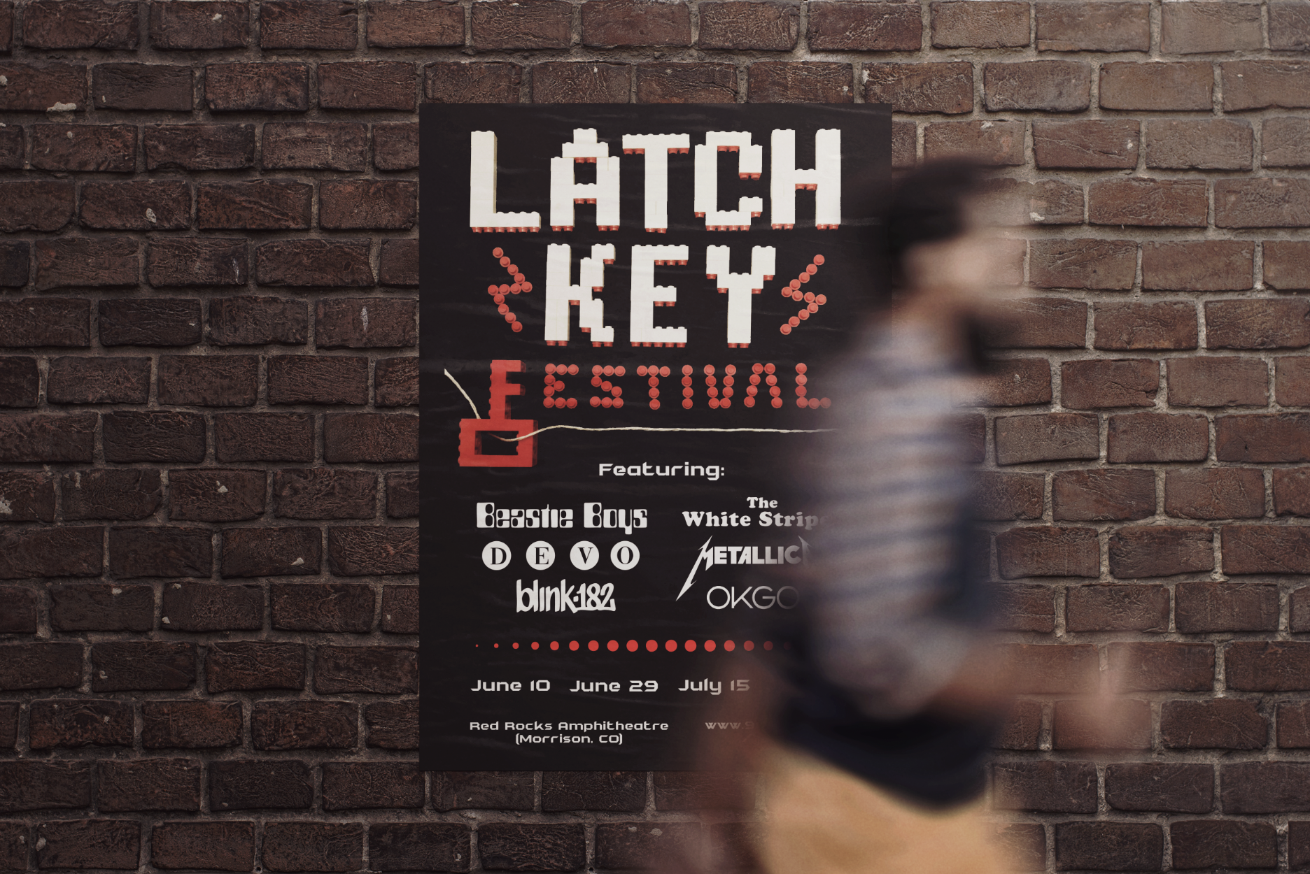
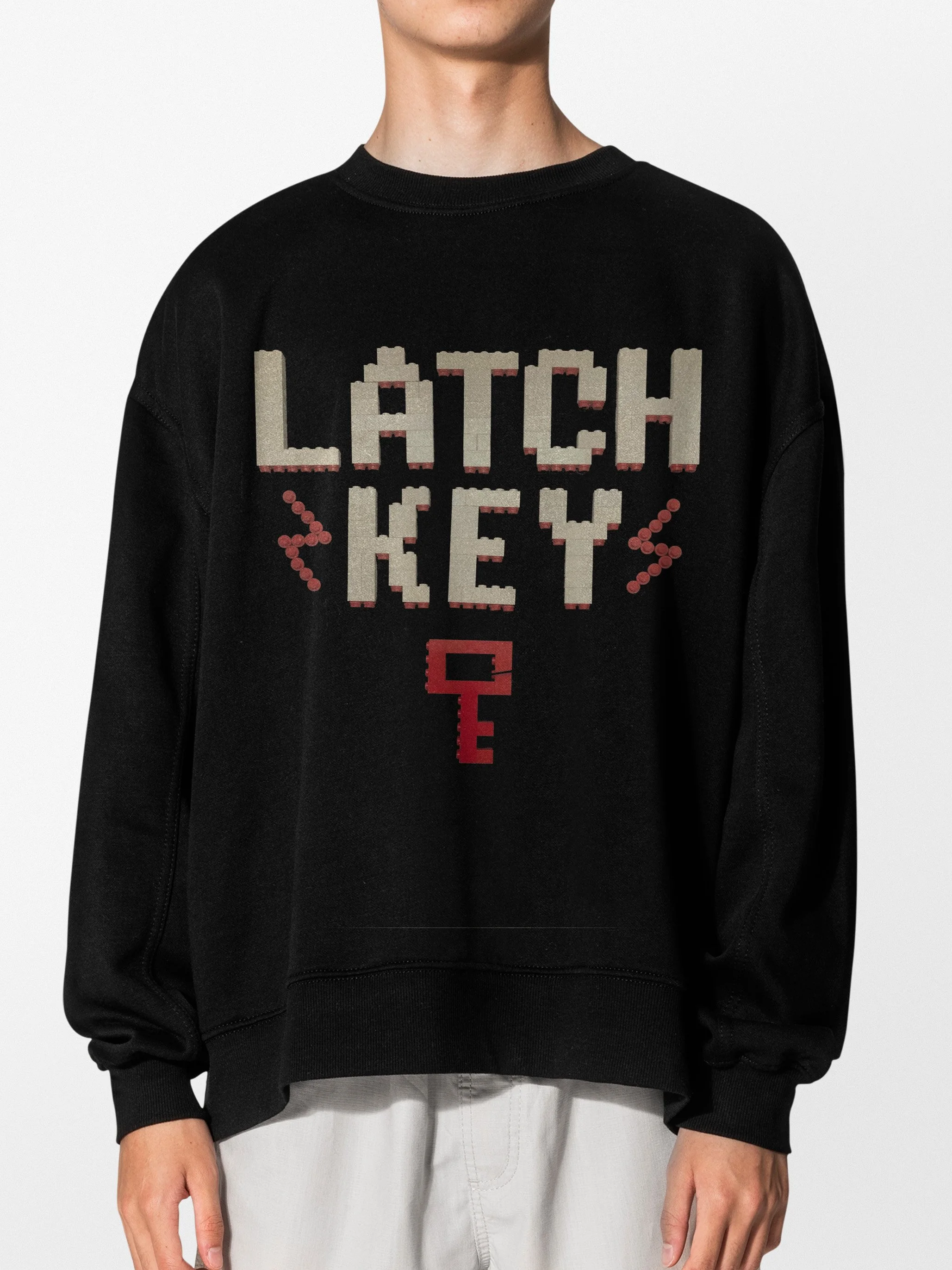
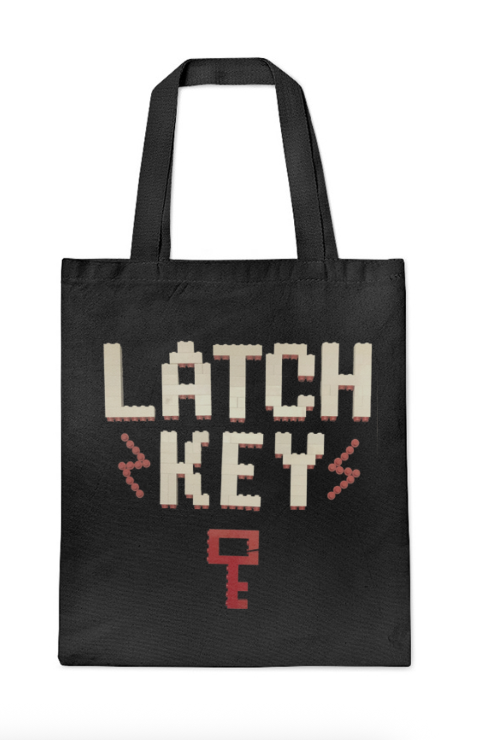
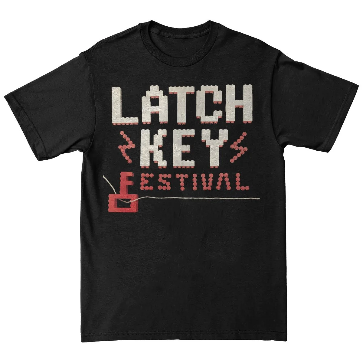
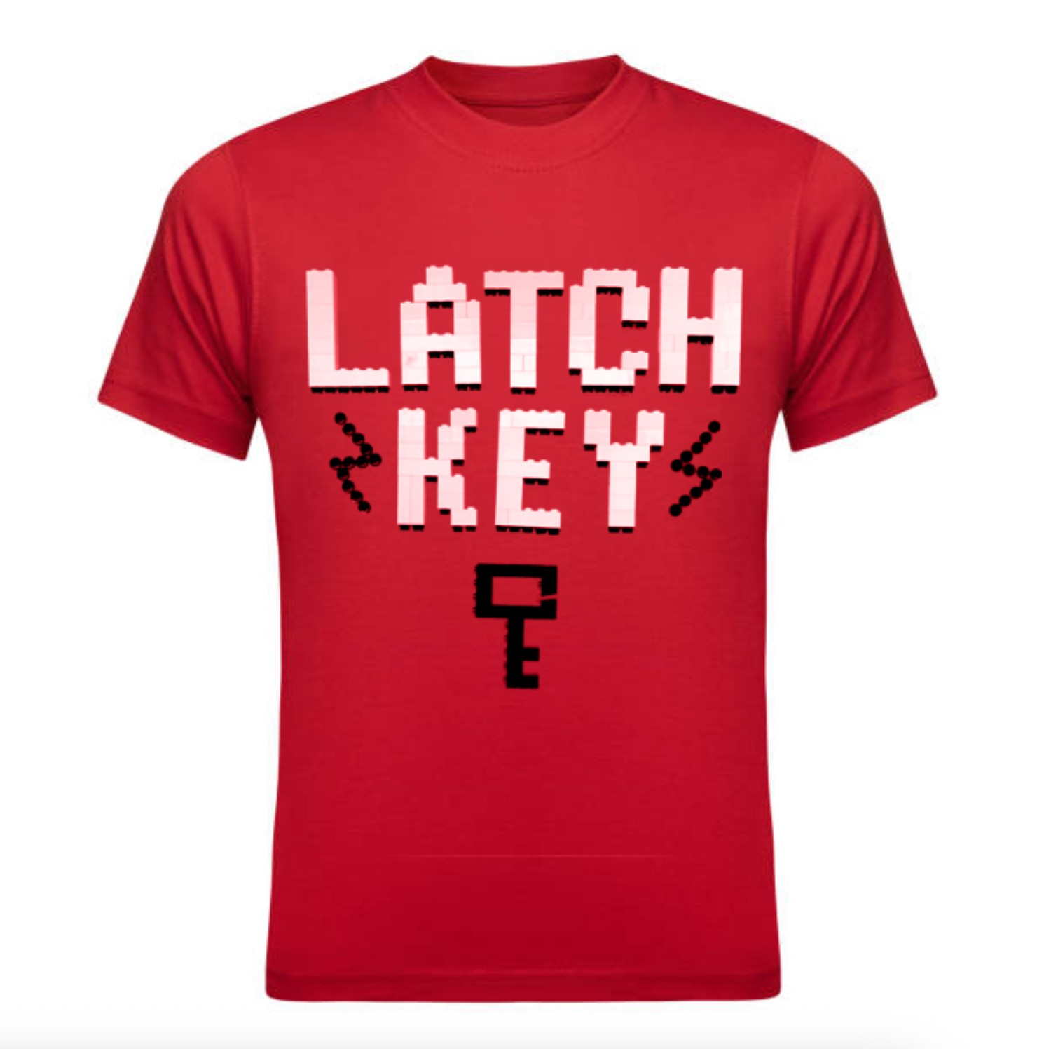
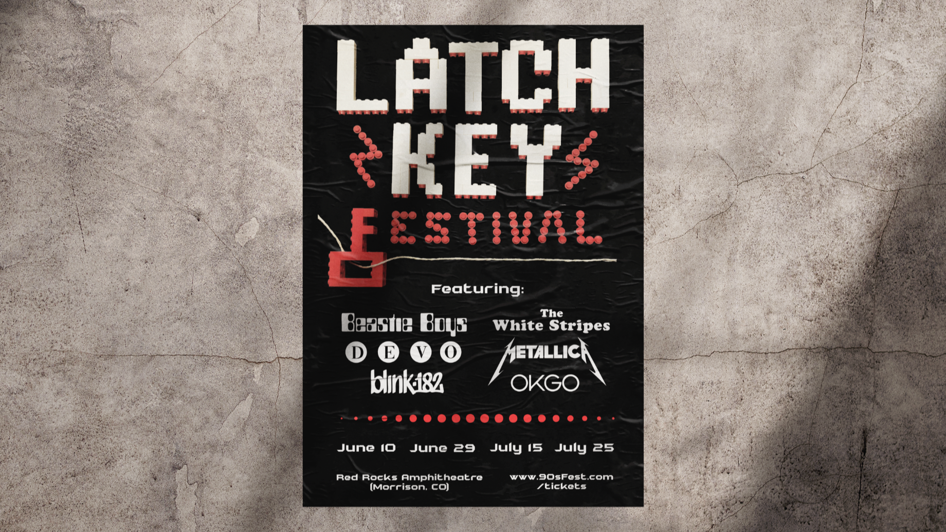
Latchkey Music Festival explores the intersection of analog and digital techniques to transform typography into a sensory experience. LEGO bricks were used to build the letterforms, capturing the raw, nostalgic tactility of the 90s. A key icon was also incorporated into the composition to represent the independent spirit of that generation and the added responsibility they often carried.
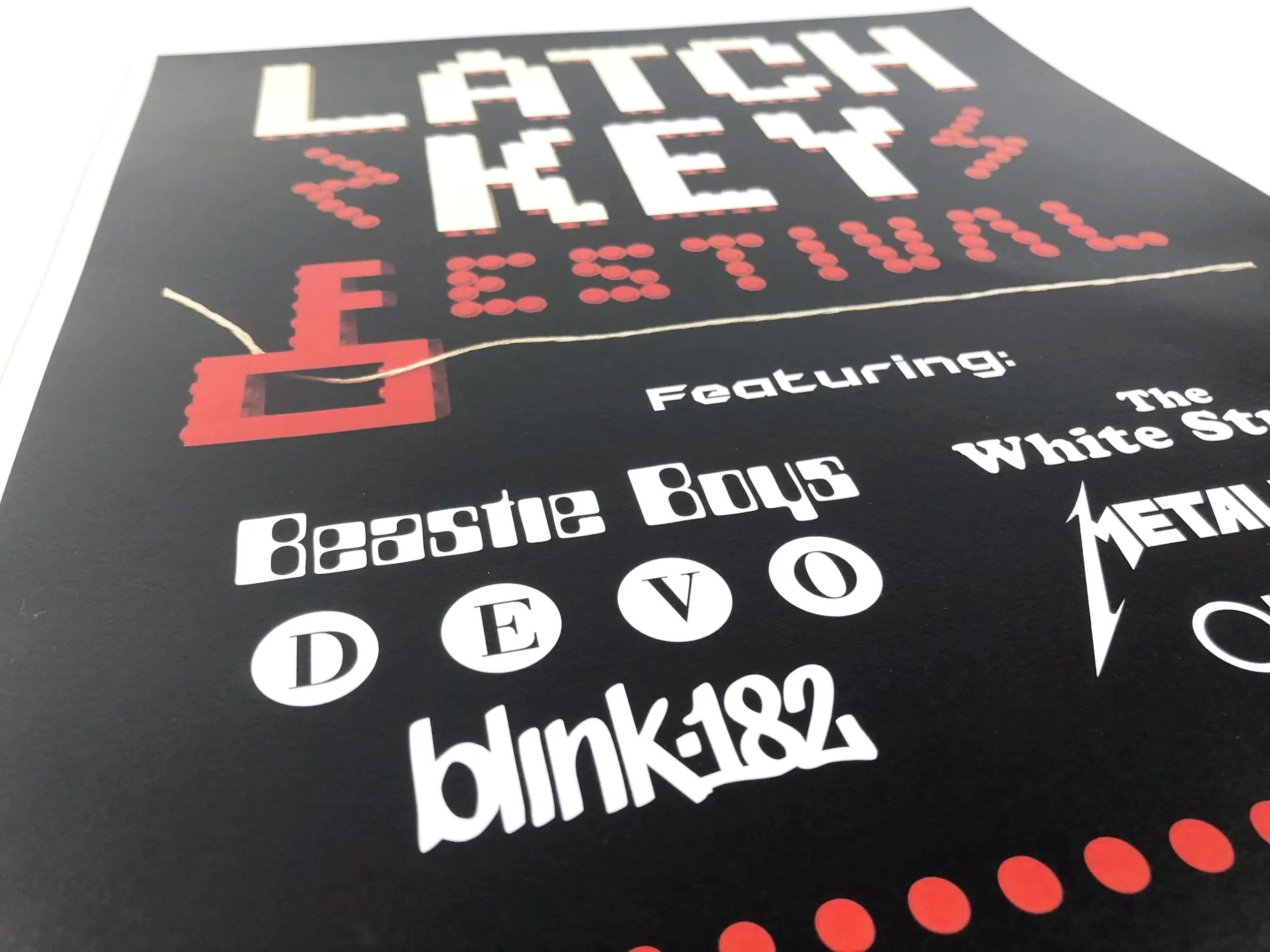
Incorporating an analog element was a primary requirement, and working with LEGO proved to be a complex undertaking. Navigating the variety of available parts—ranging from 2x2s and 3x3s to technic components and small round pieces—required careful selection, while working within a strictly limited color palette demanded precise planning. Refining these jagged, physical forms digitally to ensure legibility while retaining their grit was a significant part of the process, ultimately resulting in a design that emphasizes a deliberate, hands-on aesthetic.
Timeline
October – November 2024