What I learned

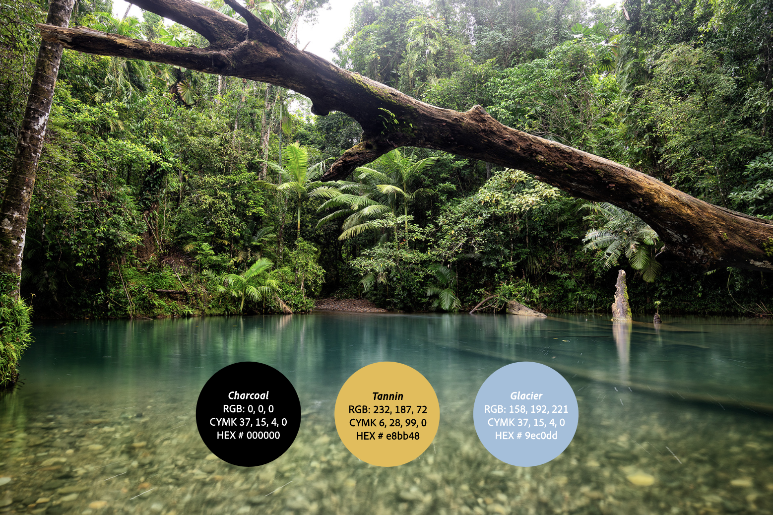
As my first full branding project, I learned how to build a scalable visual system from scratch—translating abstract ideas into clear visuals and designing nature-inspired patterns that felt cohesive and organized. I also gained experience using structured diagramming to develop the core symbolism and design direction for an ecotourism brand.

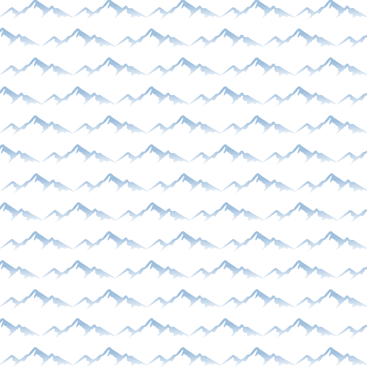
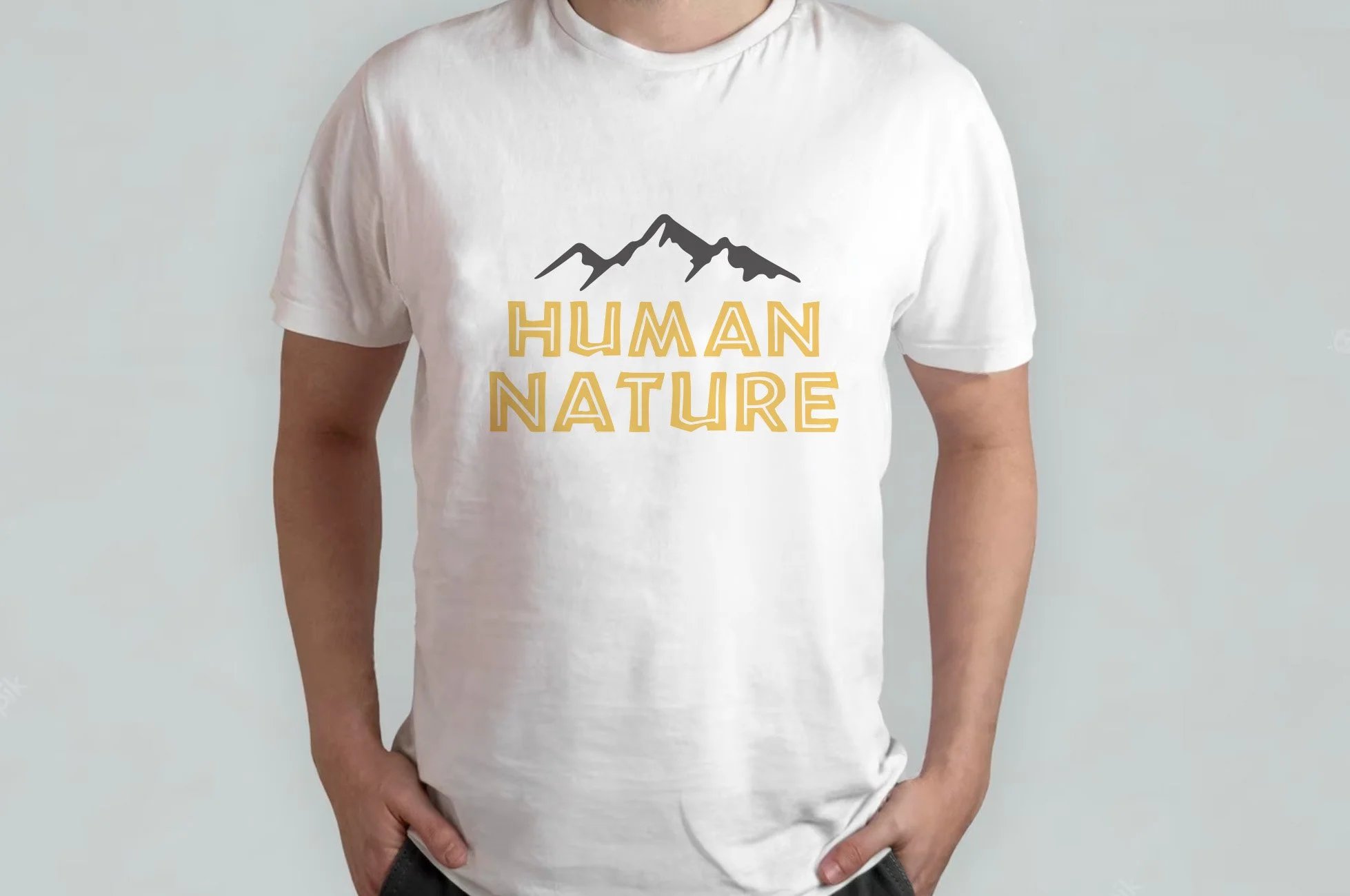
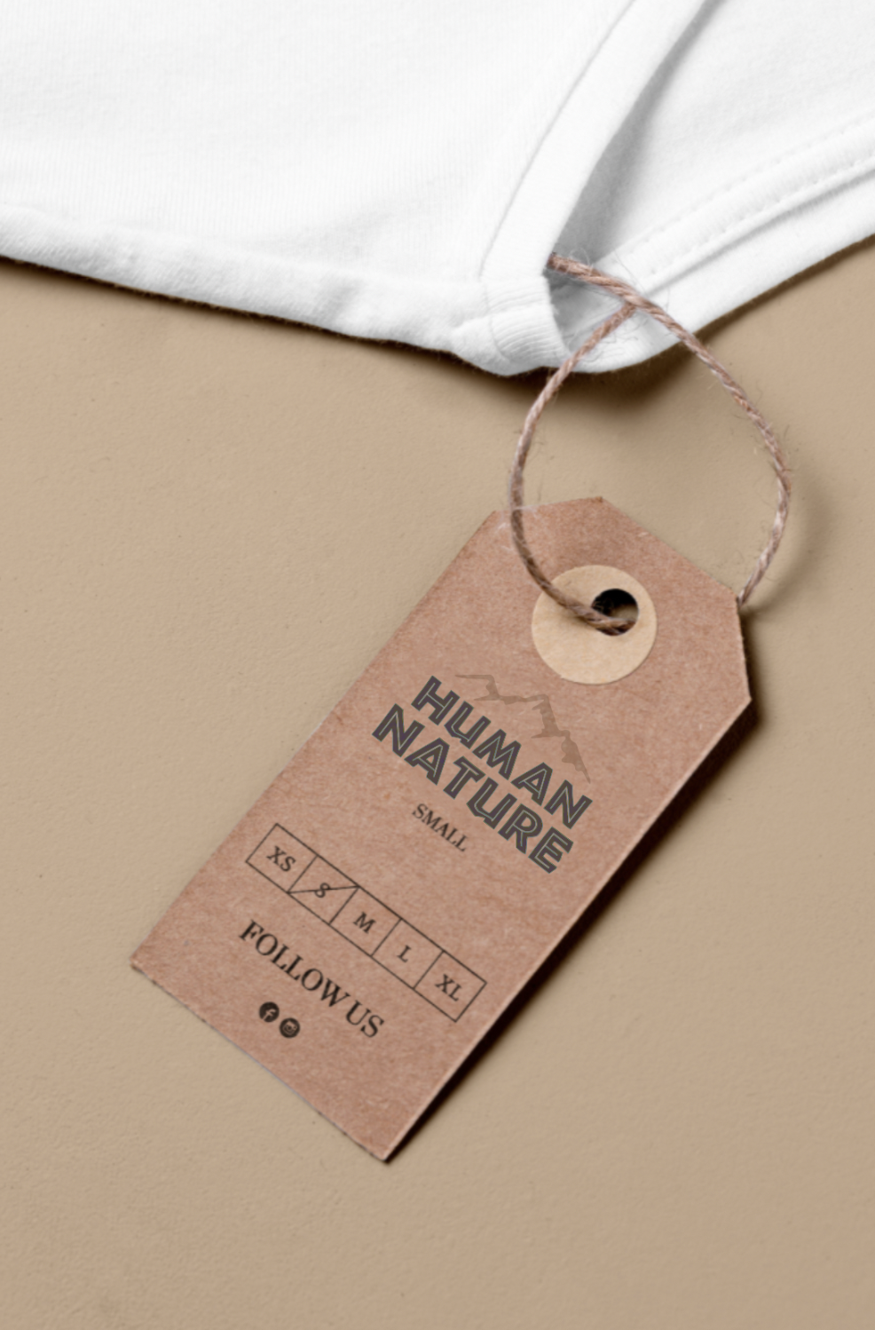
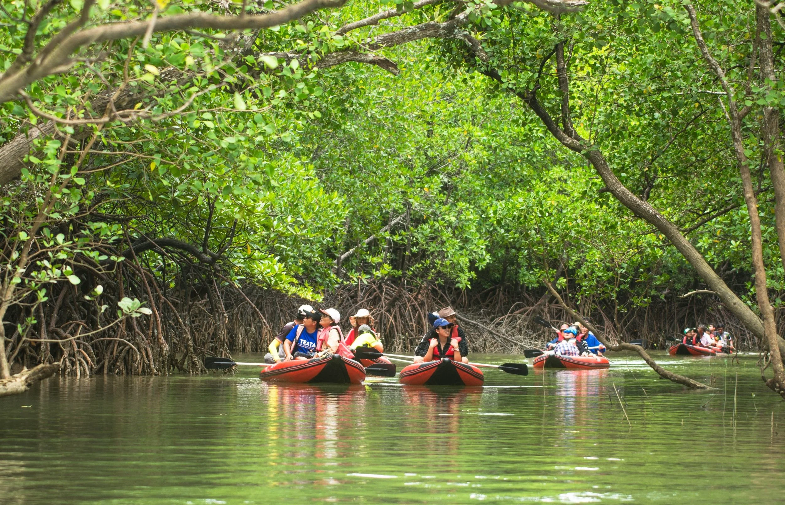
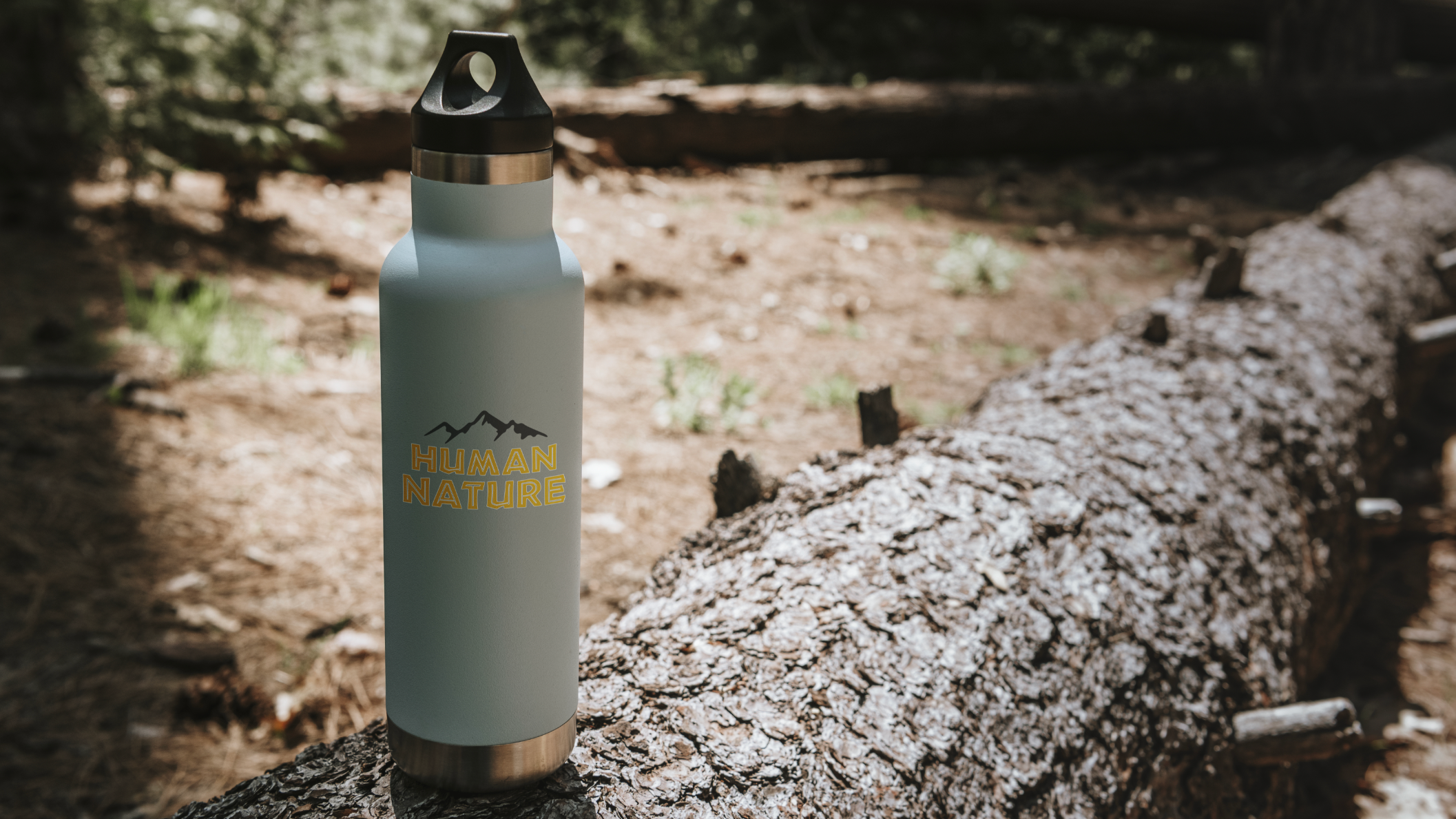
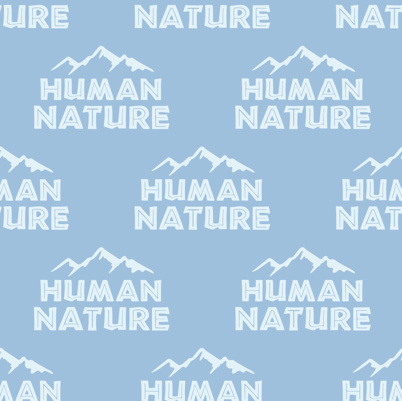
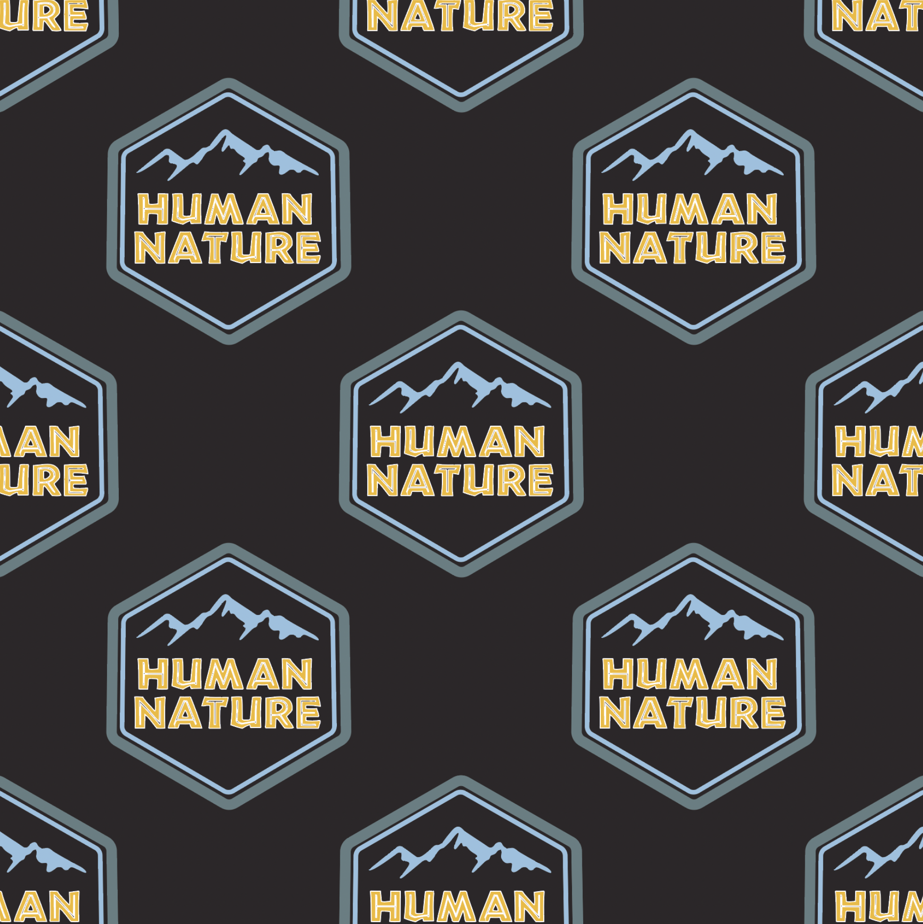
Human Nature Branding

A typographic brand identity for an ecotourism company blending tropical vitality and volcanic strength to convey exploration and connection to nature.

Project Scope: Branding | Typography | Patterning

Project Duration: January 20–February 9, 2022

Tools Used:  Photoshop | Illustrator

Project Objective

This project explored how design can translate natural systems into visual communication. After drawing a primate, a letterform, and prelite from a hat, I developed an ecotourism company concept centered on reconnecting people with nature. The goal was to distill these elements into a clear identity that reflects both environmental awareness and human curiosity.

Design Strategy

My process began with diagramming the relationships between the primate, mineral, and letterform to uncover thematic connections. From there, I shifted toward branding an ecotourism company, using the diagram as the foundation for form, symbolism, and tone. Through iteration, sketching, and refinement, I built a visual system that balanced organic inspiration with a structured, modern design approach.