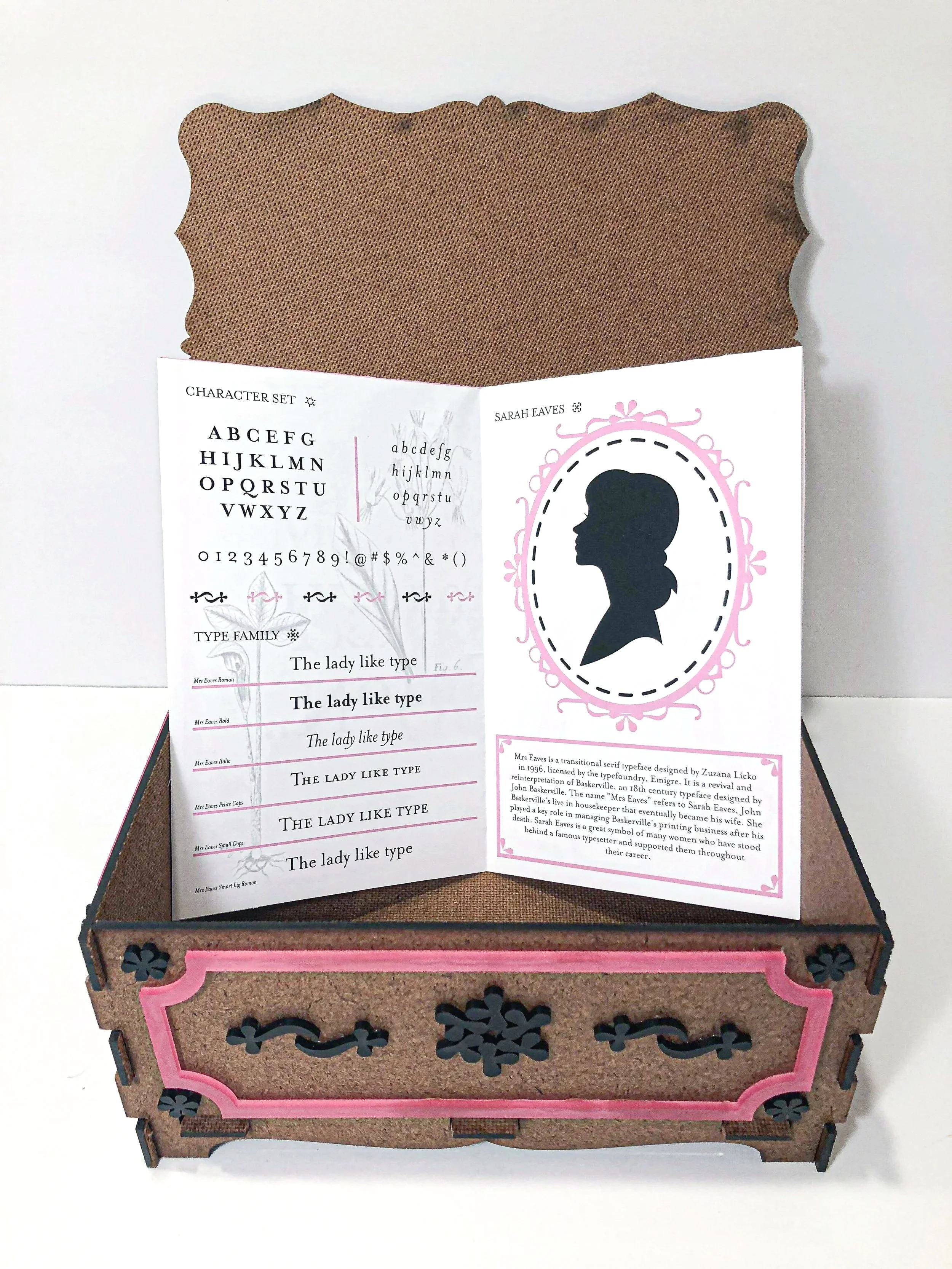
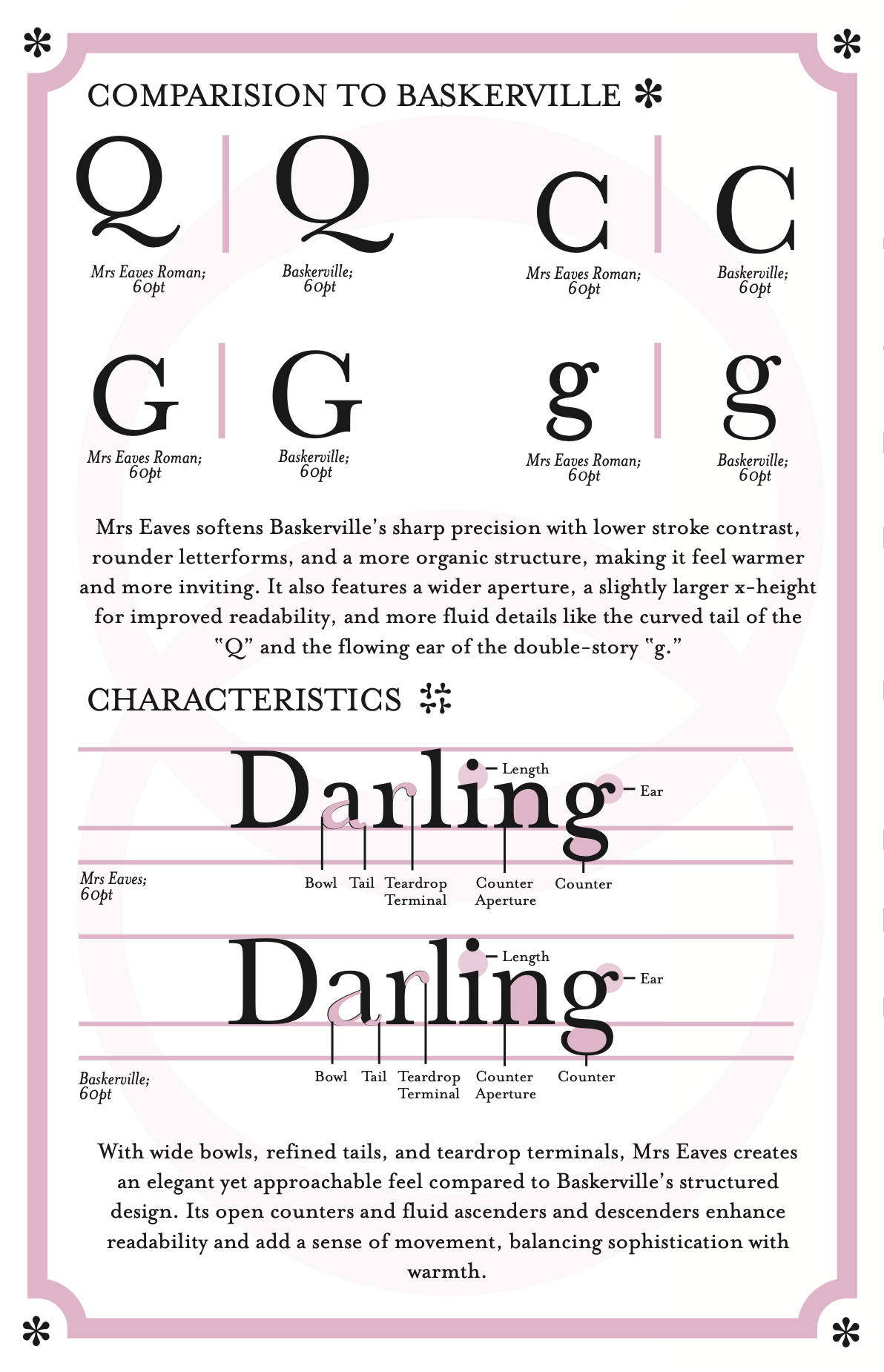
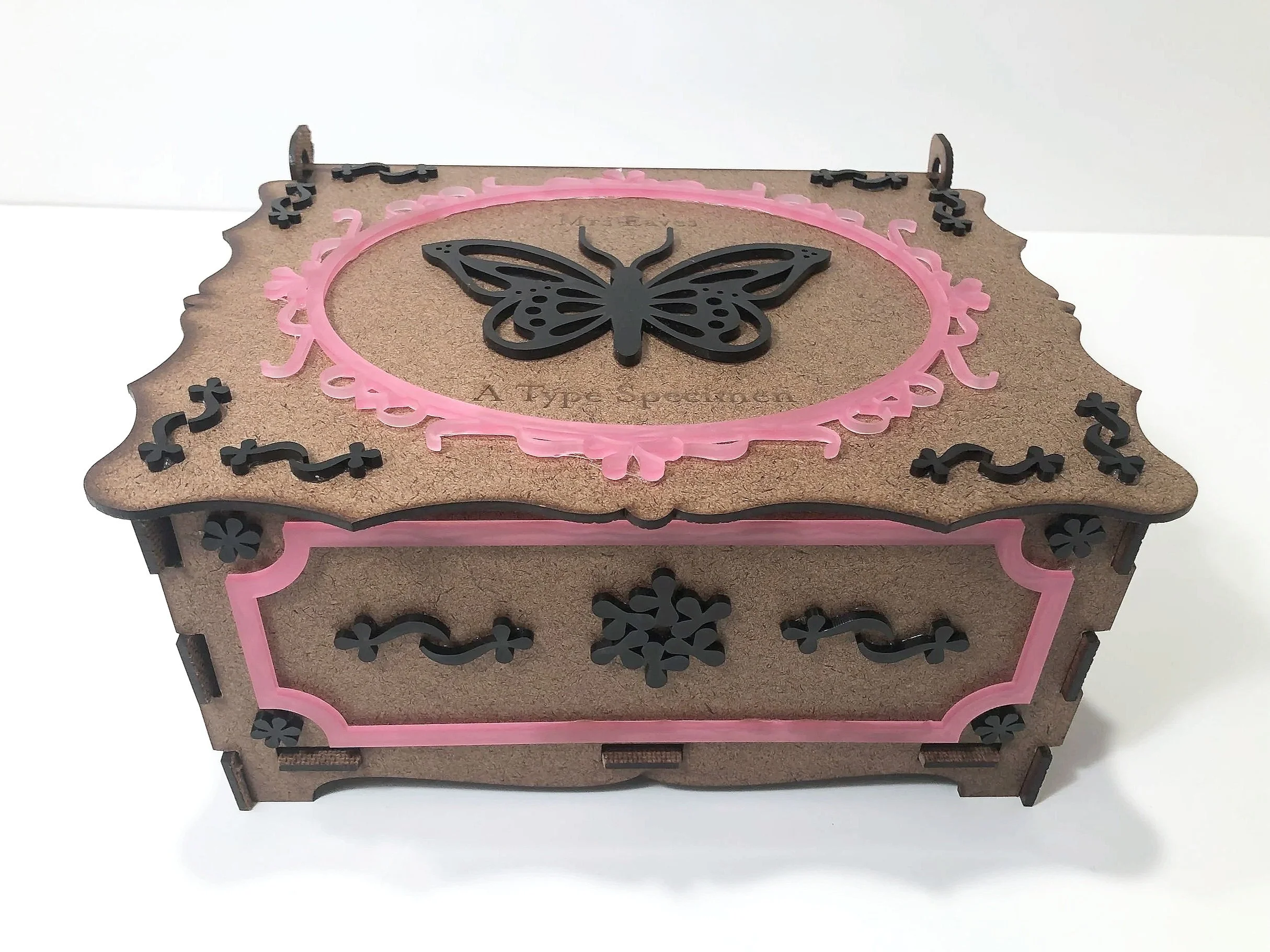
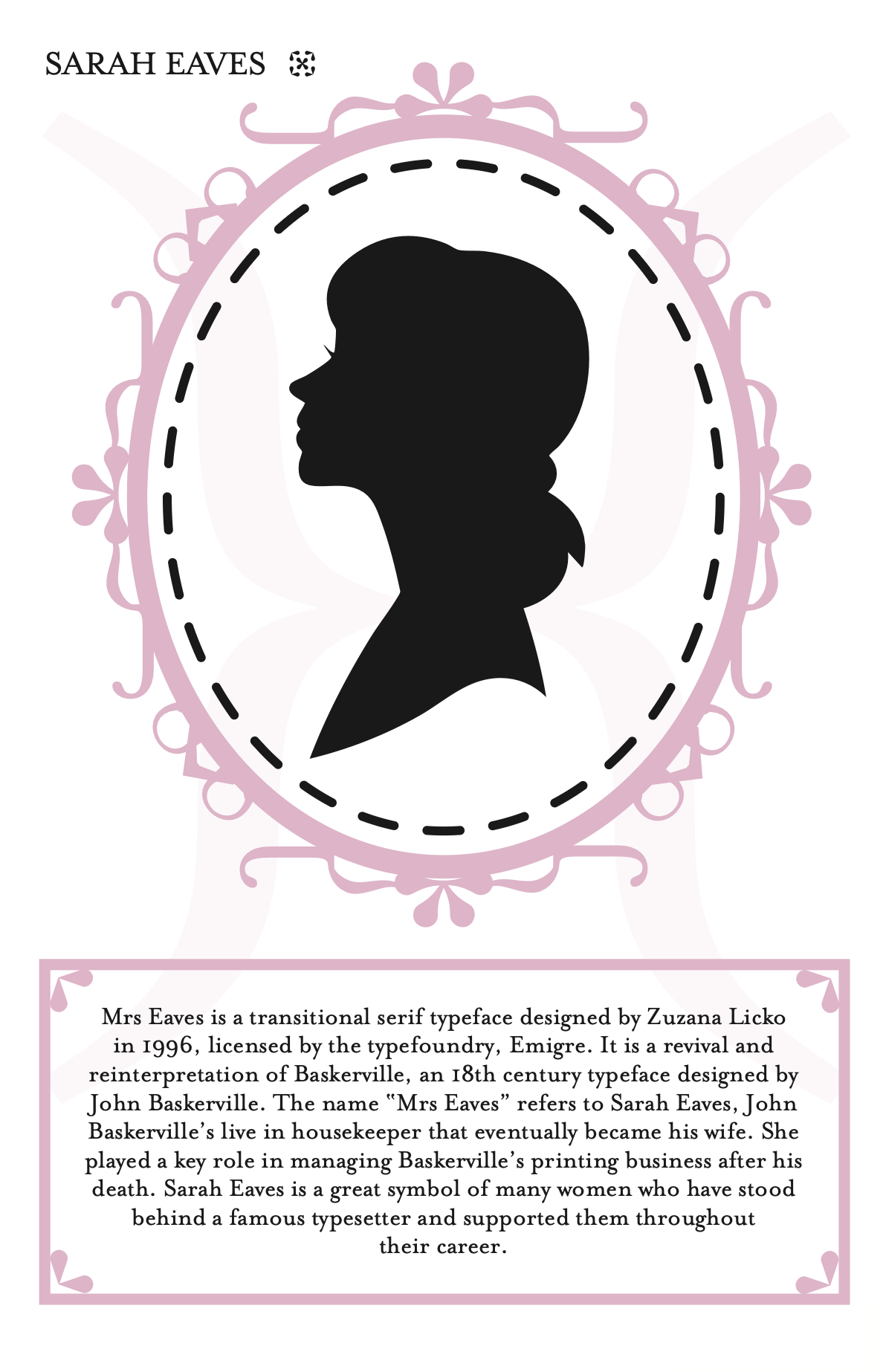
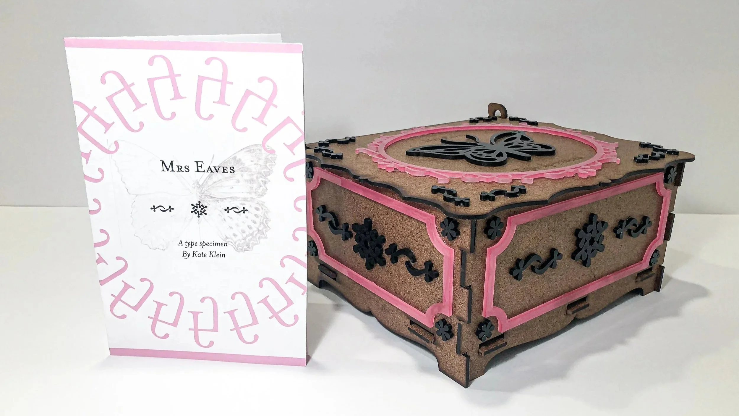
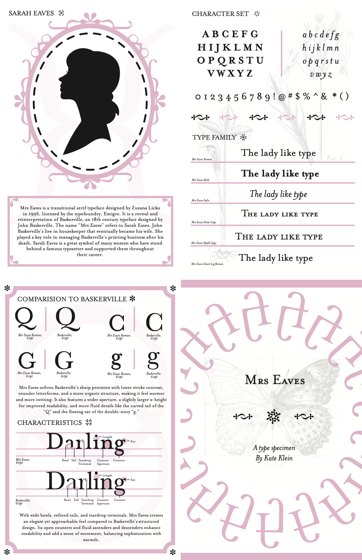
Mrs Eaves Type Specimen

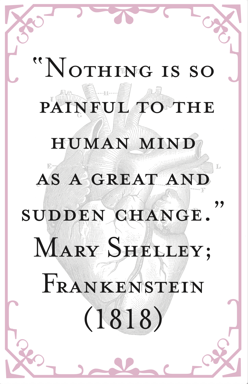
A folded type specimen showcasing Mrs Eaves, balancing its delicate femininity with historical references through scientific drawings and excerpts from Frankenstein.

Project Scope: Typography | Print Design | Book Design

Project Duration: Feb 2-Feb 24, 2024 

Tools Used:  InDesign | Illustrator | Lightroom

Project Objective

This project explored the Mrs Eaves typeface through a type specimen designed around Mary Shelley’s Frankenstein. The goal was to highlight the elegance, versatility, and refined character of Mrs Eaves while creating a specimen that functions as both a readable publication and an unfolded poster. By integrating a literary excerpt, annotations, and typographic hierarchy, the design demonstrates how the typeface operates across scales and communicates both form and narrative.

Design Strategy

I began by researching the origins and historical influences of Mrs Eaves, identifying its distinctive curves and classical forms. Using layout studies, annotation, and typographic hierarchy, I structured the specimen to clearly showcase the typeface’s glyphs, variants, and applications. The excerpt from Frankenstein served as the content framework, with careful attention to readability, rhythm, and scale. Imagery and visual layering were incorporated to enhance the typeface’s character and femininity, resulting in a specimen that celebrates Mrs Eaves as both a functional and expressive typographic tool.

What I learned

I gained a strong understanding of typographic anatomy and terminology while developing editorial design and information hierarchy for a type specimen booklet. I also learned the basics of structural packaging design, treating the box as a precise multi-part system, and used glyph manipulation to extend the typeface’s identity into a cohesive 3D application.