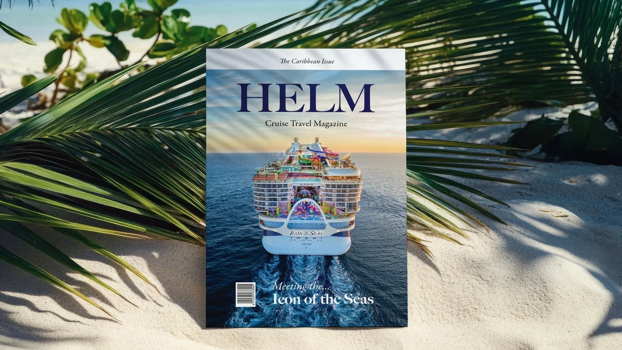
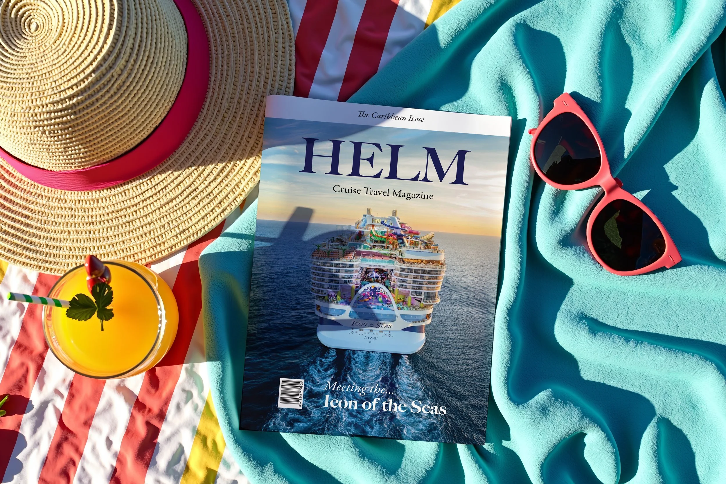
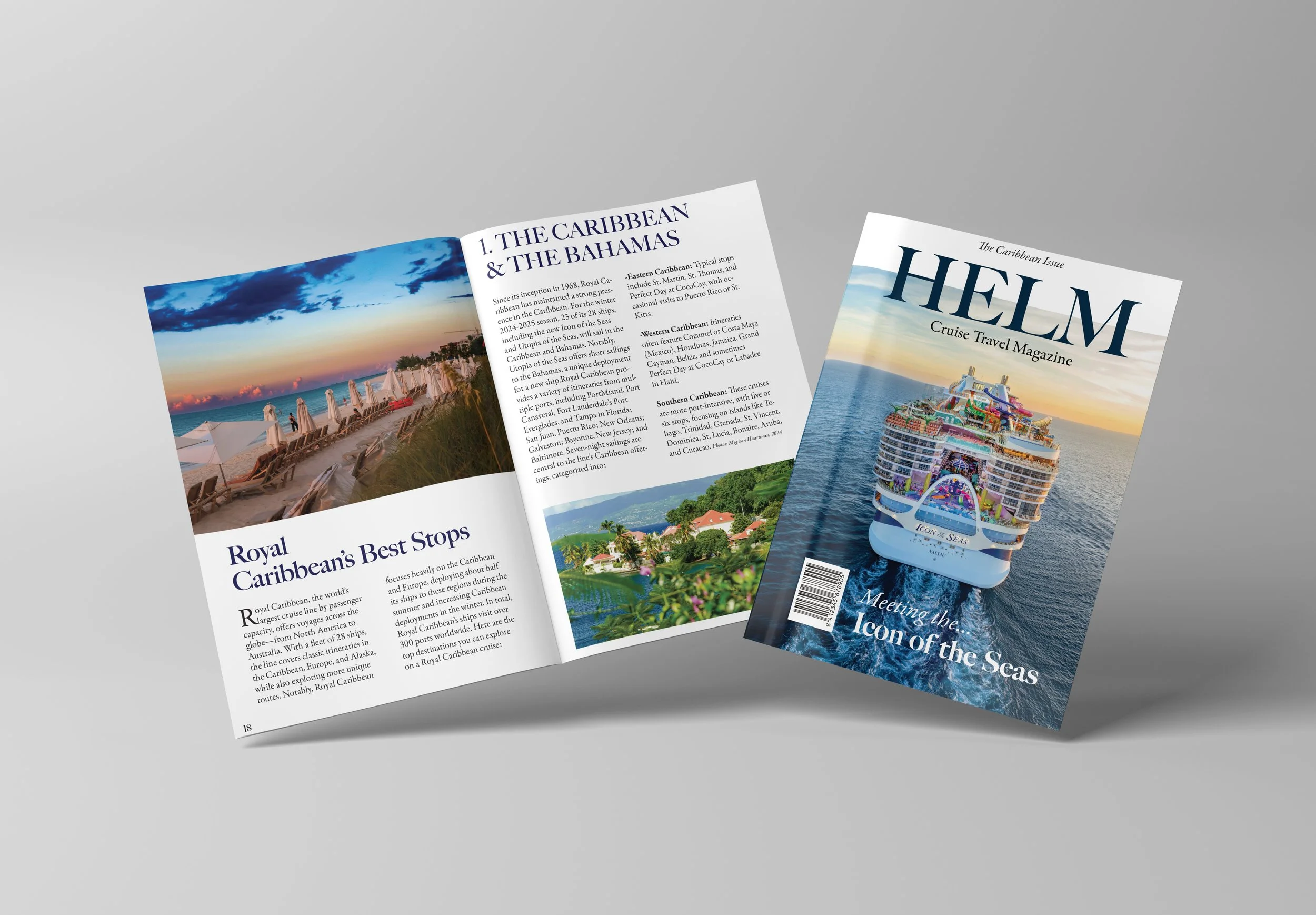
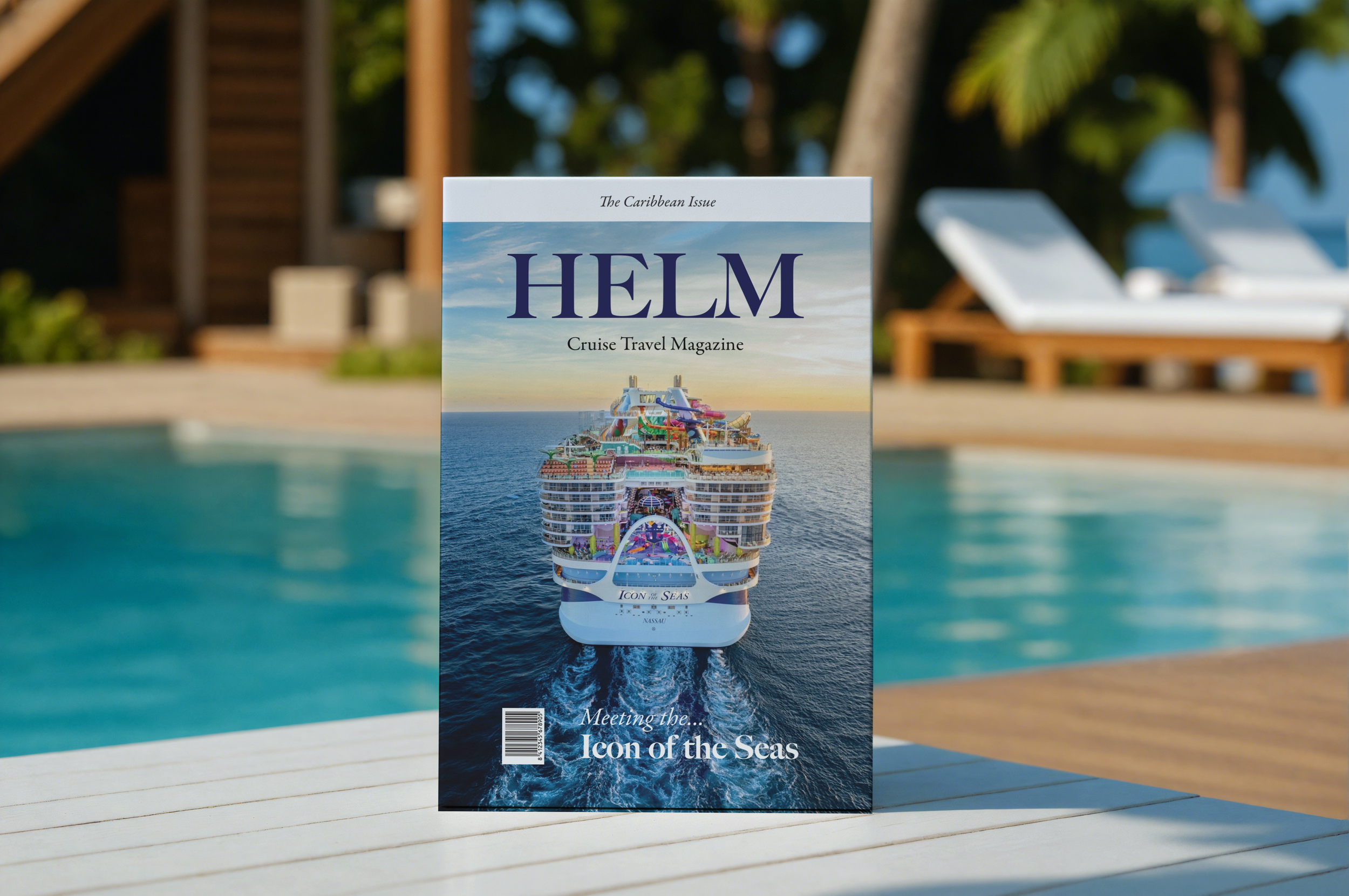
I began by researching the target audience—passengers seeking guidance and inspiration—and mapped content priorities for readability and engagement. Using a modular grid system, I structured the cover, table of contents, departments, and feature article to balance hierarchy, imagery, and typography. Departments were designed with varied layouts to accommodate lists, short narratives, and editorial picks, while the Feature Well emphasized long-form storytelling with immersive photography. For the digital version, content was adapted to maintain clarity and interactivity in ReadyMag. Throughout, I focused on typographic precision, visual consistency, and flexible design that translates seamlessly between print and web, resulting in a magazine that is both functional and visually compelling.